Use Excel to analyze Twitter data
Would you like to know who is the most active tweeter in your field? Wouldn’t it be great if you knew what your competitor is doing on Twitter to attract customers? Do you wish you could see where in the world people are tweeting about your products? Well, you can! Using a free add-in for Microsoft Excel called “Analytics for Twitter” you can use powerful analytical tools within Excel 2013 (or Excel 2010) to get new insights into Twitter data.
Introducing “Analytics for Twitter”
The Analytics for Twitter application is the result of a joint initiative between Microsoft and ISV Gold Business Intelligence partner Extended Results. The application was first introduced in 2011 for Excel 2010 and in March 2013 an updated version for Excel 2013 was announced. The analytical tools called PowerPivot and Power View that provide the rich visual analytics that are used in the Analytics for Twitter application are included in Excel 2013 out of the box (in the Microsoft Office 2013 Professional Plus version), for Excel 2010 you can download them free of charge.
How to get started
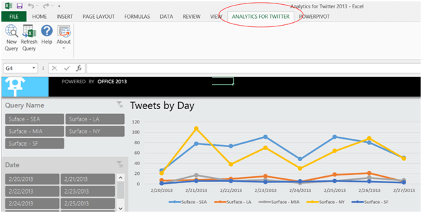
The first thing you need to do is download and install the Analytics for Twitter application. The application is free of charge and there is an Excel 2010 version and an Excel 2013 version. When you’ve installed the application and open up Excel you will see a new tab in the ribbon.
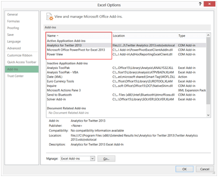
You need to make sure that the “Analytics for Twitter” add-in is enabled in Excel, as well as the “Power View” add-in and the “Microsoft Office PowerPivot for Excel” add-in. You can find these settings by going to File ->Options ->Add-ins.
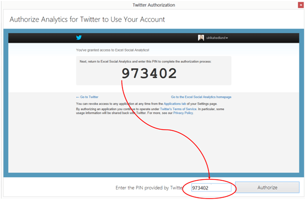
Before you can start with your analysis you need to link the application to your Twitter account and authorize it with a PIN code.
Start your analysis
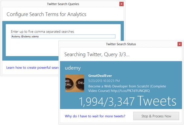
When you have installed the application and authorized your account you can get started with your analysis. In the “Analytics for Twitter” Tab click “New Query”. A search box will open up where you can enter up to 5 search terms separated by a comma. You can search for hashtags (#), mentions ( @) or just free text. Since I’ve recently launched a number of courses on Udemy, I wanted to do a search to see who is tweeting about Udemy, if tweets are spread all over the world, and how other instructors are marketing their courses on Udemy.
Understanding the search results
Once the query is finished and you’ve refreshed the data the spreadsheet will update and show rich visual graphs of your selected search terms. There are 7 different sheets in the spreadsheet showing different perspectives of the data.
Summary – here you will get a summary of the number of tweets per day, the frequency of tweets by time of day, and top tweeters.
Here I can see that during May 19th and May 26th there are 5179 tweets containing “Udemy” (as a hashtag, mention or written in free text). The most active tweeter is “GreatDealEver” and the most frequent hashtags in these tweets are (other than Udemy) are iPhone, iOS, iPad and programming.
People – in the People sheet, you will see who the key tweeters are for your search terms including mentions and retweets.
Tweet Map – here you will see a geographic map of where the tweeters are located and a distribution of when they tweeted.
In the Tweet Map, I can see that most of the tweets containing “Udemy” are coming from Canada followed by the USA, a very small portion of the tweets are coming from Asia.
Mentions – here you will see the most talked about tweeters for your search terms.
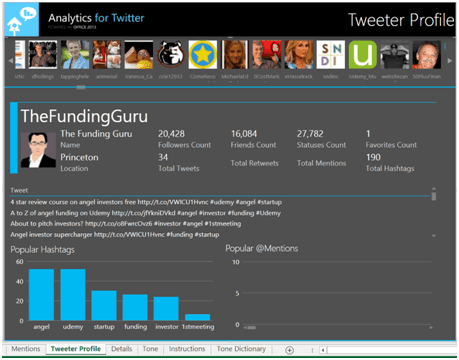
Tweeter Profile – here you will see details about tweeters, such as profile pictures, the number of followers/friends and the most talked about tweeters for your search terms.
Here I can learn more about people who are tweeting about Udemy. I can see their tweets, how many followers they have and their popular hashtags.
Details – here you can see each individual tweet and filter on key items.
Tone – in the final sheet you can see if the tweets are negative or positive. There is a “Tone Dictionary” where you can change the weighting of different words such as “amazing” or “horrible”.
A fantastic tool for marketers
The “Analytics for Twitter” is a fantastic tool that provides a lot of valuable insights. The tool is easy to use and the report is elegantly and professionally designed. Analytics for Twitter makes full use of the rich visualization capabilities offered by Power View such as the Bing maps and dashboard views. The only downside to the tool is that the time interval is limited to 8 days, other than that I can warmly recommend it. Good luck with your Twitter analysis!
(If you have difficulties reading this article, you can access the full article in pdf here)


