
Visualize your data with charts
Introduction (00.04)
If you have a lot of numbers in your spreadsheet it really helps to visualize your data using charts. In this version of Excel it is much easier to select appropriate charts since Excel analyzes your data and recommends charts for you. In this video you will learn how to use charts to spot trends and you will learn how to use the updated charting tools to make your graphs really stand out.
Visualizing data with Recommended Charts (00:32)
Here I have a sales report showing sales for 2014. To make this report more visual I am going to add charts.
On this first worksheet I have a table showing sales and forecasted sales by region 2014. First I want to add a chart that shows only the sales by region. In Excel 2013 it’s much easier to select charts, since Excel provides you with recommendations.
To add a recommended chart, mark the data you want to include in the chart. In general it’s better not to include totals since the details might be hard do see. Click the “INSERT” tab, instead of manually selecting one of the many charts available in the Charts section click “Recommended Charts”. Excel will analyze your selected data and recommend the best possible chart to visualize it for you. You can click through the various recommended charts to see which one you prefer. In this case I prefer the first column chart so I’ll click OK to insert it into my spreadsheet.
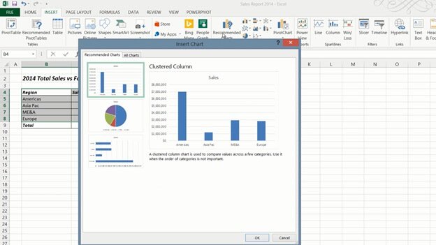
I’ll move the chart by holding down the left mouse button and dragging it to the desired position.
Modifying charts with the simplified Chart Tools (01:40)
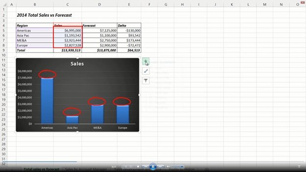
Now I want to make some modifications. In Excel 2013 Microsoft has cleaned up the Chart tools so that they are easier to use. To modify a chart, mark the chart so that the Chart Tools appear. Under the “DESIGN” tab, in the Chart Styles Gallery you get a live preview of what your chart will look like with different designs. I’ll select this dark design which provides better contrast. You can easily make modifications to your chart using one of the three buttons that now appear next to your chart. The first button gives you options to modify the chart elements, the second button the style and the color of your chart and the third the data selection. I want to add the sales results on top of each column so I’ll click the first button and mark the “Data Label” check box. Then I’ll click the arrow next to the “Axes” and uncheck the “Primary vertical axis”. Finally I’ll mark the title and write”2014 Total Sales by Region”. To close down the chart tools click anywhere outside the chart area.
Showing portions with pie charts (02.46)
Now I want to insert another chart showing sales contribution by region. I’ll mark the sales results again, click the “INSERT” tab and “Recommended Charts”. Here I’ll select the pie chart. I’ll move it and apply the same dark style from the Chart Styles gallery. I want to show the percentages for each piece of the pie so I’ll click the plus sign and check the option to show “Data Labels”, I’ll click the arrow to see more options and select “Data Callout”.

Then I’ll uncheck the option to show the legend. Now I want to change the rotation of the pie so that the Americas region is on the left. To open up the formatting tools for the data series just double-click the pie. The formatting pane is new in this version of Excel and makes it easier to make changes since the formatting pane doesn’t cover your chart. Here I’ll change the angle of the first slice with 180 degrees. I will also separate the pieces of the pie slightly by dragging the “Point Explosion” bar.

I’ll move one of the data labels by double-clicking it and then positioning it where I want it. Finally I’ll just update the title to “Sales contribution by region”. There, that’s looks great!
Inserting a combo chart (04:01)
Now I want to add a third chart that shows the sales versus forecast and the difference between the two in a combo chart. To insert a combo chart, mark the data you want to include in the chart. Here I’ll select the Sales, the Forecast and the difference between the two (Delta). On the “INSERT” tab, click “Recommended charts”, click the second tab called “All charts” and click “Combo” at the very end. Here you can select from a number of predefined combo charts. I’ll select this column/line chart. If your data series has different scales, select the option to insert a “Secondary axis”. I’ll add a secondary to the data series with the deltas. To insert the chart click OK.

Now you have a combo chart that clearly shows multiple data series in one. I’ll apply a dark design from the Chart Style gallery. For the title of this chart I want to use the worksheet title. To link the chart title to text in your spreadsheet, mark the title and then write an equal sign in the formula bar, mark the title and press enter. The chart title is updated automatically.

Visualizing data with bar charts (05:10)
In this second worksheet I have a table showing sales per account manager. If you want to chart all data in a table, you can mark any cell in the table. I’ll click the “INSERT” tab and then “Recommended Charts”. Here Excel recommends a bar chart. The bar chart is typically recommended instead of the column chart if you have very long names for the items in the series like I do here.

I’ll move the chart and resize it by holding down “Shift” as I drag the bottom right corner to keep the proportion of the chart. I’ll add a nice design from the Chart Style Gallery.
Changing the order of items in a bar chart (05.44)
By default bar charts start with the first item at the bottom. When I have this chart next to the table it can be a bit misleading, so I want to switch the order of the items on the category axis. To change the order of the category names, I’ll open up the axis formatting pane by double-clicking the vertical axis in the chart. To change the order of the items on the vertical axis, mark the check box “Categories in reverse order”. There now the chart makes more sense next to the table.

Showing trends with line charts (06:17)
On the third worksheet I have historical data showing sales by region for 2013 and 2014. I’ll mark any cell, on the “INSERT” tab I’ll click “Recommended Charts”. Excel recommends a line chart. Line charts are great for showing trends over time. I’ll resize the chart and from the”DESIGN” tab I’ll select a nice design in the Chart Style Gallery. I’ll mark the title and link it to the title of my worksheet. I want change the layout so that the region legend is placed to the right next to the lines. To get a visual representation of various layouts, on the “DESIGN” tab, in the “Chart Layouts” section click the “Quick Layout” button. Here I can see an overview of various layouts, and here is the one I was looking for.

Changing order of the data legend (07:06)
As you can see the legend of the chart follows the order of the data in my table. But here it would make more sense to change the order to match the order of the lines in the chart. You can always change the order of the data in your table, but an easier way to do this is by changing the legend order in the chart. To change the order of the data legend, on the “DESIGN” tab, in the “Data” section click “Select Data”. In the Legend Entries window, mark the region you want to move and change the order by clicking the up and down arrows. To apply the change I will click OK. There, now the data legend matches the order of the chart lines. Finally I’ll just remove the Axis title by marking it and pressing Delete on my keyboard.

Using the Quick Analysis Tools (07:54)
In this last worksheet I have profits by region over time. Instead of inserting a separate chart, I will visualize the data in the table itself. In this version of Excel Microsoft has introduced “Quick Analysis”, a tool that helps you analyze your data.
To use the Quick Analysis tool, mark the data you want to visualize. A little Quick Analysis icon appears in the bottom right corner, click it to see the various analysis options available. Under the first “FORMATTING” tab, you can select data bars that show little bar charts within each cell, you can also select conditional formatting that colors cells based on their value relative to each other.

You get a live preview of all options so that it is easier to select one. Here I’ll select the “Color Scale”. I also want to show each month’s average so I’ll click the Quick Analysis button again and select “TOTALS” and then “Average”, now the average for each month is displayed under my table.
A little green triangle in the cells shows that there might be an error in the formula. Click the exclamation mark to see the error message. Here Excel warns you that the formula doesn’t include the adjacent cells. This is fine since we only want to calculate the average one column at a time, so to ignore all error messages, mark all cells and then click the exclamation mark and select “Ignore error”.

Finally I want to show the trend using Sparklines. Sparklines, which were introduced in Excel 2010 are tiny charts that fit into a cell. I’ll go to the “SPARKLINES” tab and select a line chart. As you can see tiny little line charts are inserted next to my table showing the trend over time.
Closing (09:43)
By knowing how to effectively use charts, you’ll be able to make your data much more visually appealing.