Visualize data with basic charts
Introduction (00:04)
Welcome to Business Productivity – I’m Ulrika Hedlund. If you have a lot of numbers in a spreadsheet it really helps to visualize your data using charts. With charts it’s a lot easier to see things, like trends if your sales are increasing or decreasing, market shares – what product is dominating the market, and to compare results – what were our costs this quarter compared to last?
Microsoft Excel 2010 has a lot of tools for creating and modifying charts. Unfortunately all of these tools can be a bit overwhelming sometimes. In this video I will show you the most basic steps for creating and modifying charts. After watching this video you will know what chart to use when, how to insert a chart in your spreadsheet and how to make basic modifications. In the video called “Spice up your charts” I‘ll show you more advanced ways in which you can modify your charts. But for now, let’s get started with the basics.
To insert a chart (01:08)
Here I have an Excel spreadsheet with sales results for 2012. I have total sales versus forecast, sales by account manager, sales contribution by region, sales development from 2011 to 2012 and profits by region. To make this report more visual and to facilitate analysis I want to add charts to the report. First I want to add a chart that shows only the sales by region.
To add a chart to your spreadsheet, mark the data you want to include in the chart. In general you don’t include totals if you have them in your table. Go to the “Insert” tab and then select the type of chart you want to insert under the “Charts” section. Here I’ll select a column chart; there are many different types you can choose from. I’ll just select a basic 2 dimensional clustered chart.
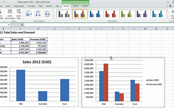
Here I can quickly see which region sold the most and how the different regions compare to one another. I’ll just make a few modifications. I’ll click on the title and change it to ”Sales 2012 (USD)”, and then I’ll remove the legend since we only have one set of data in this chart.
Adding a chart using a keyboard shortcut (02:18)
Now I want to add another chart that also shows the forecasted sales. If you have two sets of data you want to compare side by side you can do this by using a clustered chart. I’ll mark the two columns of my table and instead of going to the “Insert” tab I can use the keyboard shortcut Alt+F1. Just like before a clustered column chart is inserted in my worksheet. This is the default chart, you can change it to any chart of your choice, but I recommend that you keep this one as it is the one most often used.
Adding titles and colors to your chart (02:51)
With a quick look at the chart I can see that the Australia and Euro regions beat their forecast but the US didn’t meet theirs. When you have the chart marked, a new menu appears in the ribbon called “Chart Tools”.
Under the Design tab you can make major changes to your graph, such as switching how rows and columns are displayed. I can choose between a number of different chart layouts, here I’ll just choose the same one as before, and I’ll add a title to my chart, “Sales vs. Forecast 2012”. I can also change the colors. Here I’ll select this gradient blue color.
Chart a subset of your data and link the title (03:31)
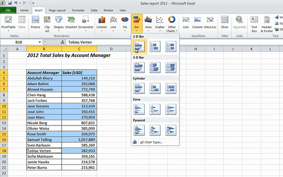
In this second worksheet I have a table showing sales per account manager. Here I want to insert a bar chart. The bar chart is very similar to the column chart, basically it’s a column chart rotated 90 degrees. This is useful if you have very long names for the items in the series like we do here. I also find it easier to read if you have a lot of items in the series.
If you have continuous data like this and you want all of it to be in the graph you can just click any cell in the table and again go to the ”Insert” tab and select ”Bar”. If you only want to select a subset of your data hold down the CTRL key and mark the items you want to include and then insert your chart.
I’ll click undo twice here to go back to the chart showing all the account managers.
I’ll resize the chart so that all the names are visible and then I’ll remove the legend. I want to change the title here, but instead of typing it in by hand I can link the chart title to the title of my spreadsheet. To do that just write an equal sign and then click on the cell containing the title.
Changing the number format of the axes (04:46)
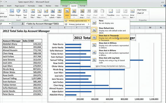
I also want to change the format of the horizontal axis to thousands of dollars. To do that I’ll go to the ”Layout” tab and click “Axes”, here I’ll select the “Primary Horizontal Axis” and select to “Show Axis in Thousands”. Now the numbers displayed in the chart have changed to make it easier to read.
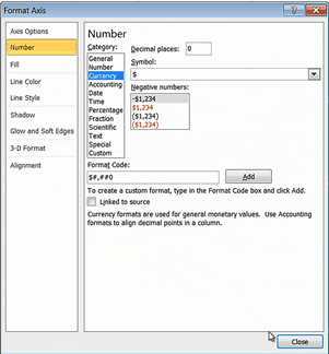
Let me undo and show you another quicker way to do this. Just double click the axis to open up the “Format Axis” dialog box.
Here I’ll change the “Display Units” to thousands; I’ll also go to the “Numbers” section and select currency to show the dollar sign next to the numbers in my chart. There, now the chart is complete.
Showing portions with pie charts (05:32)
Let’s continue to the third worksheet where I have sales contribution by region in percent. Here it would make sense to use a pie chart. The pie chart is a very good if you want to show different portions of a single set such as market share or in this case each region’s contribution to sales.
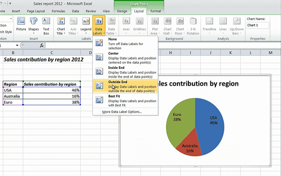
I’ll mark one cell in my table and click “Insert” and select the “Pie Chart” I’ll select the basic 2 dimensional chart. To make this chart easier to read I want to add the percentages and the region labels next to each piece of the pie. To do that I’ll go to the “Design” tab and select this first layout option, now to put the labels outside the pie I’ll go to the “Layout” tab and select “Data Labels” and here I’ll click on the “Outside End” option. There, that’s perfect!
Showing trends with line charts (06:26)
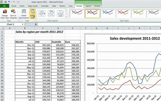
Now let’s move on to the fourth worksheet where I have historical data showing sales by region for 2011 and 2012. Here I want to insert a line chart. The line chart is great for showing trends. I’ll click a cell in the table and again go to the “Insert” tab and then select a line chart. I’ll resize the chart and from the “Design” tab I’ll select a layout that includes a title. I’ll click the title and give it a new name “Sales development 2011 to 2012”. I’ll remove the vertical axis title to make some more space.
By looking at the data for 2012 we can see a very positive trend in sales, we do however know from historical data that we have a very seasonal business with high sales at the end of the year and reducing sales in January.
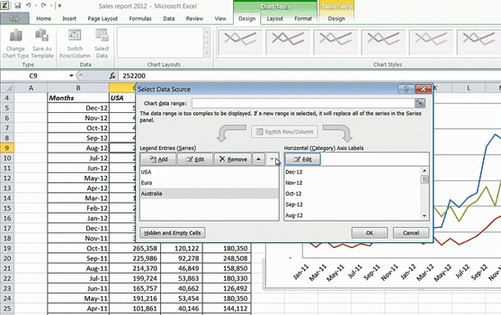
As you can see the legend of the chart follows the order of the data in my table. But here it would make more sense to change the order of the Australia and Euro region so that the label is aligned with the lines. You can always change the order of the data in your table, but an easier way to do this is by changing the legend order in the chart. To do that go to the “Design” tab, in the “Data” section click “Select Data”.
Here I’ll select Australia and move it down one step. There now that makes more sense.
Add Sparklines (mini-charts) to see trends directly in your table (07:58)
In this last worksheet we have profits by region over time. Since I want to see the trend it would make sense to insert a line chart. Let me insert one here, as you can see the lines overlap so it’s quite difficult to determine the trend for each region.
Another way to visualize numbers is by using something called ”Sparklines”. These were introduced in Microsoft Excel 2010 and they are tiny charts that fit into a cell. These can be very convenient if you have a large table with lots of numbers and you just want to give a visual representation of the data in the table, or as in this case where the lines overlap and the line chart is too messy.
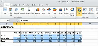
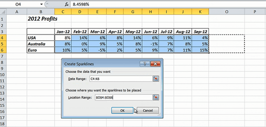
To add Sparklines, mark the data range you want to chart, click “Insert” and then under the “Sparklines” section select the chart type you want.
Here I’ll select the line chart. Define where you want the Sparklines to be added and I’ll just mark the cells in the column next to my table.
There, now I can clearly see that our profits for the US are declining, they are fluctuating for Australia and increasing for the Euro region.
Closing (09:19)
There are over 73 different chart types to choose from in Microsoft Excel 2010, here I just covered the basic charts that are most commonly used. You can make a lot of alterations to change the look and feel of your charts. You can watch the video “Spice up your charts” if you want to learn more on how to do this. I’m Ulrika Hedlund for Business Productivity – thanks for watching!


