Spread eye-catching stories using Sway
What you will learn
In this story-based tutorial you will learn how to:
- Create a Sway from document
- Apply and customize a design
- Add images and set focus points
- Embed content and share your Sway
The background
During an online meeting with our marketing team and branding expert, we discussed how to best share an overview of our new service offering. We didn’t want to send out a PDF or just the link to the web site – we wanted something modern and eye-catching, that we could easily update. We decided to share our story using Sway. We started structuring what we wanted to say in a shared Word document and with the document as a starting point, I started to create our Sway.
Creating the Sway
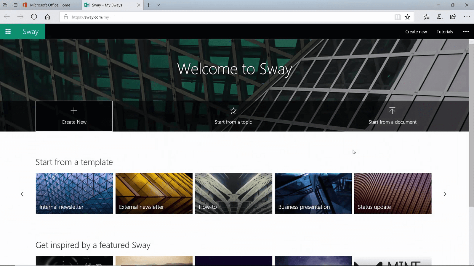
To create a Sway, log in to Office 365, click the App Launcher and then search for Sway.
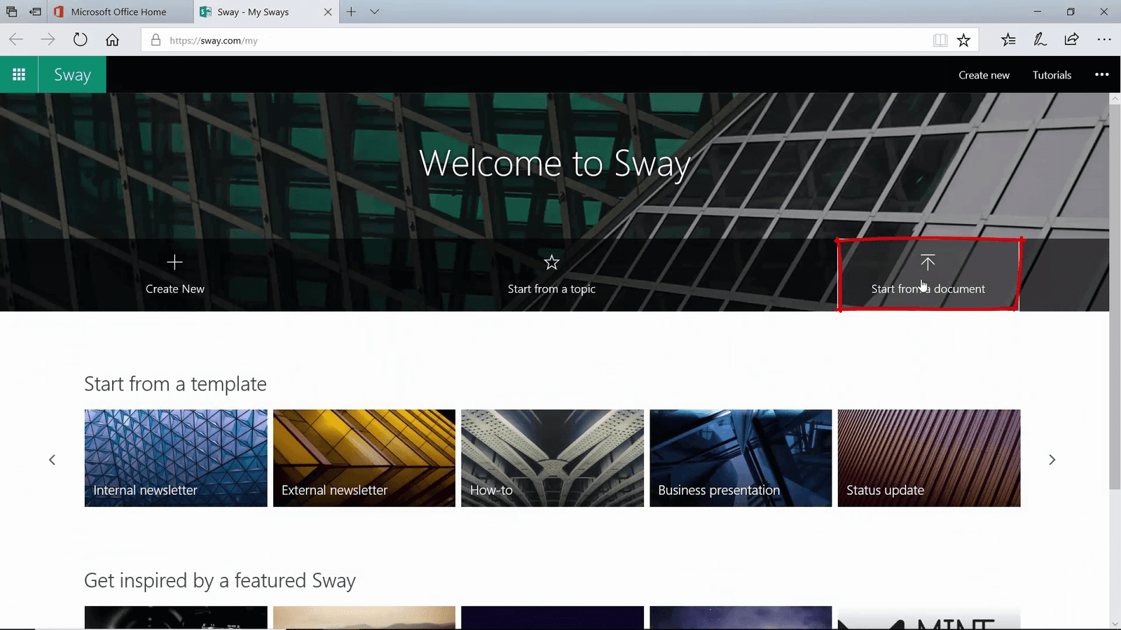
Instead of creating a new Sway from scratch, I click “Start from document” and select the Word document that we have been working on.
The content of the Word document is added to the Sway.
Adding a design
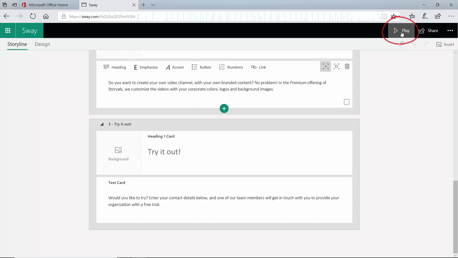
I click “Play” to see what it looks like.
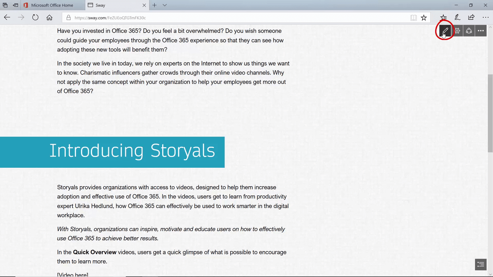
Even though I don’t like the design, the experience is much more appealing than the Word document. I click the “Pen” icon to go back to editing mode.
To change the design, click “Design”, and then “Styles.” A panel opens with a rich gallery of different styles.
First, I get to choose how users will navigate the Sway. I click “Horizontal” to try it out. In this layout you navigate the content from left to right. I prefer to be able to scroll down to see the Sway so I go back to the to the vetical navigation. Next, I review the various design options and pick one that aligns better with our corporate branding. I like this design better, but feel that it’s a bit too orange. To fine-tune a design, click “customize”.
Here you have more options for color codes, fonts and so on.
I select a color combination with orange and white. Now I need to add images and videos.
Adding images
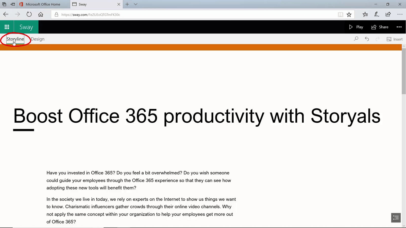
To work on the content of your Sway, click “Storyline”.
First, I’ll add a main background image. To add an image, click the image icon. Sway recommends some suggested search topics. I want to use an image from a SharePoint library that I have synchronized to my laptop, so under “My content” I will select “My device”, I will navigate to the picture I want and then click “open”. The image is uploaded to Sway. I click “Design” to get a quick preview of what it looks like.
That looks good, but now I want to see what it looks like on my mobile.
Using Focus points
Anyone can see a Sway, but to create or edit it on your mobile, you need to have the Sway mobile app installed. The Sway I just created is visible under “My Sways”.
When I tap it, the Sway opens in edit mode, I tap the “Play” button to see it live.
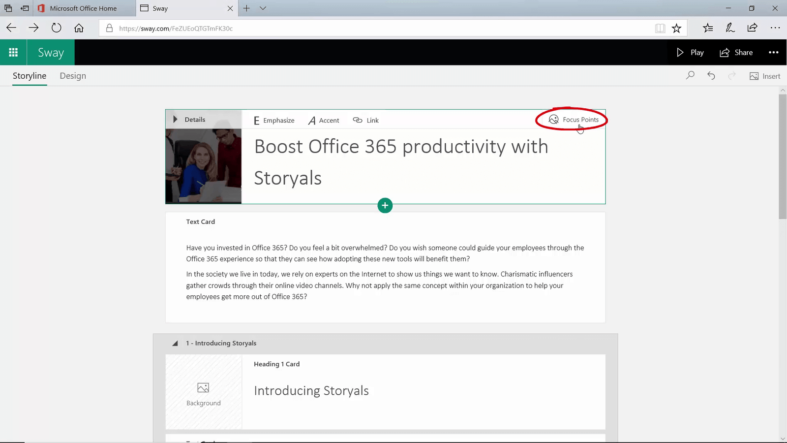
It looks pretty good, however, the logo isn’t showing. To change how Sway displays images, mark the image and then click “Focus Points”.
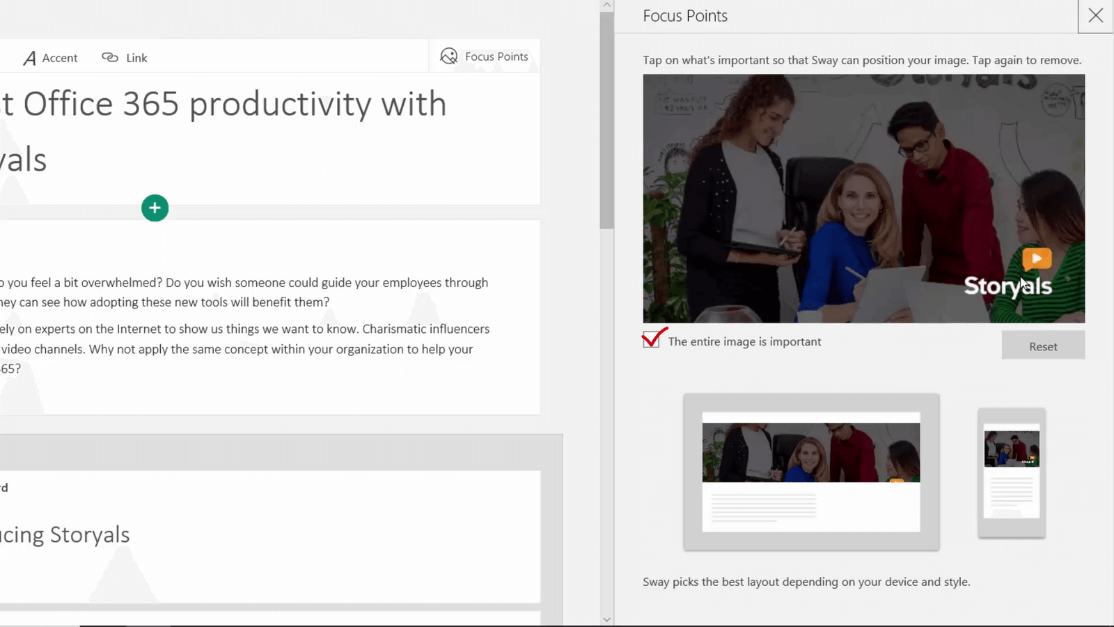
A panel opens where you can click on the image to show Sway what’s important. Or, you can mark that the whole image is important.
I mark the logo and can immediately see the result on my mobile. Now the logo is showing, but not the people. I tap the person to the far left in the picture. The Sway updates immediately – there, that looks better.
Working with text
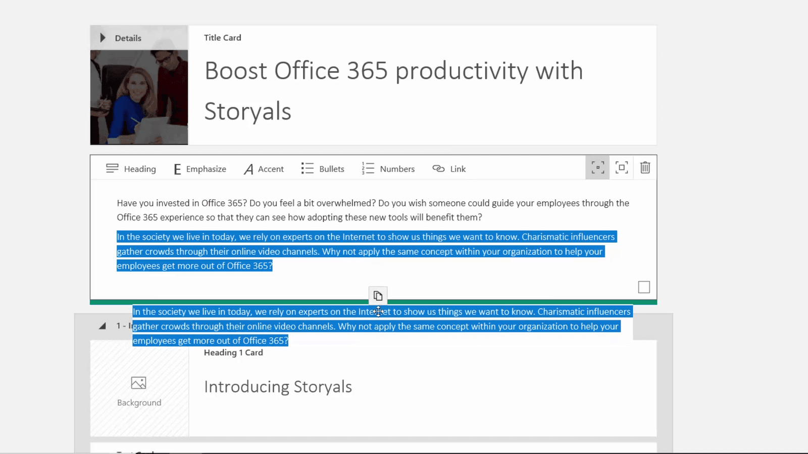
Now I want to work on the text. Instead of having it as a single block of text I want the first part to stand out more. To separate text into different content holders, mark the text you want to move, and drag it until you see a line.
To give text more emphasis, mark the content holder and then change the emphasis to “Moderate”. I click “Design” to see the changes. Much better! I do the same to other sections of the text. To emphasize certain words in your text, mark the words and click “Emphasize”.
Adding and grouping multiple images
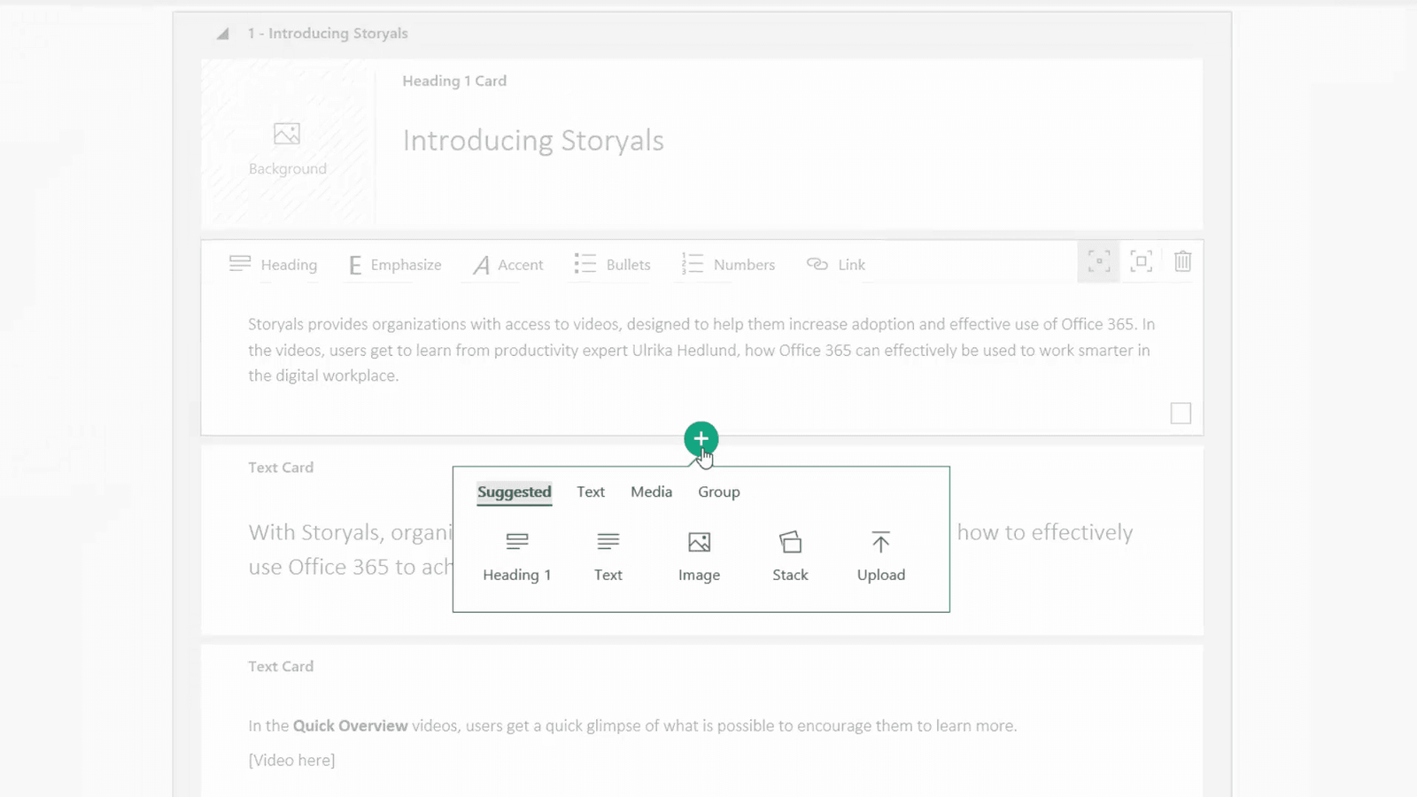
Next, I’ll add some more images. To add content to your Sway mark the holder under which you want to add the content, then click the plus sign and select what you want to insert. You can also drag and drop.
I’ll press the Windows key arrow left on my keyboard to snap the Sway window to the left, I will open file explorer and press Windows key arrow right to see the windows side by side. I press the CTRL key and mark the images I want to add to my Sway. Next I drag and drop them onto the page.
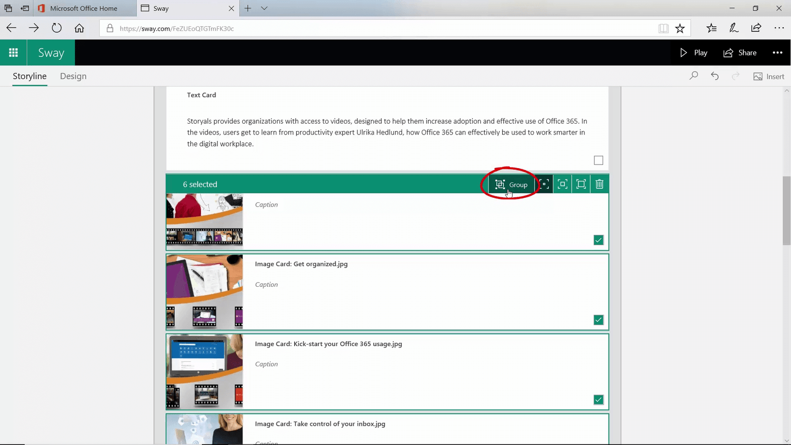
When the images have been uploaded, I click “Design” to see what it looks like. I want viewers to be able to see all images, but I don’t want them to take up so much space. I’ll mark the check box in the bottom right corner of all the images, then click “Group”.
Various groupings options are available. Here I’ll select “Stack”. I’ll click “Design” to preview. Better, but the images are too small.
I click “Storyline” to go back to my content. I’ll click the arrow to collapse the group so that I can treat them as a single object and then I change the emphasis to “Moderate”. I click “Design” to preview – great that’s much better!
Embedding content
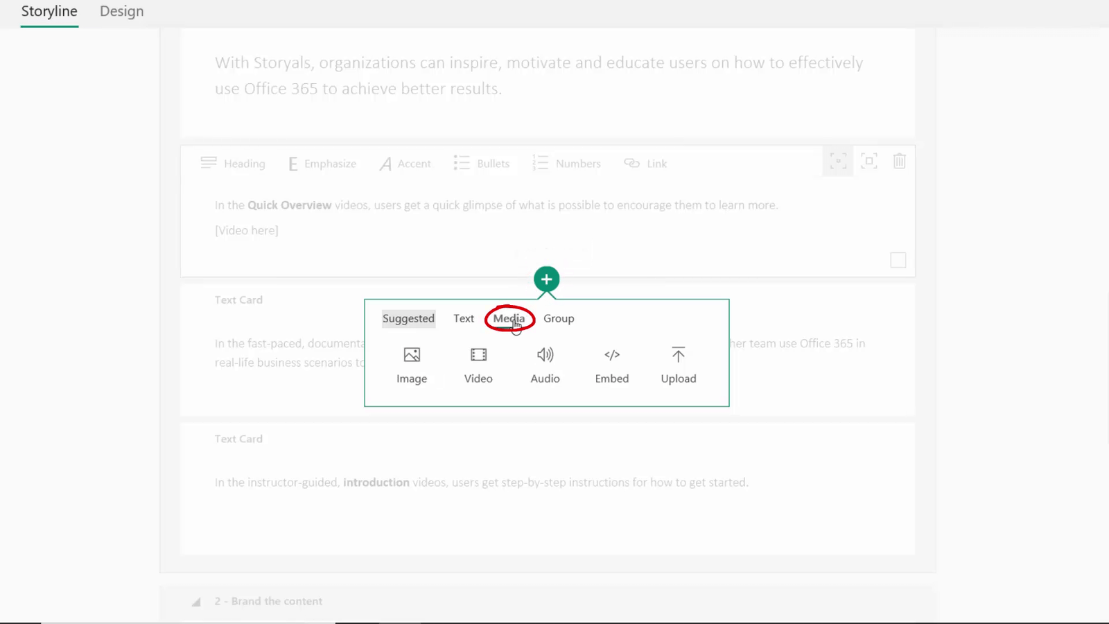
Now I want to add some of our videos. To insert a video, click the plus sign and then select Media.
If your video is available on YouTube or other public video service, click video. Since we want to add videos that are on our business video streaming service not visible publicly on the Internet, I’ll click “Embed”. I open the video, click to copy the embed code, go back to Sway and paste it in. I do the same for couple of more videos.
I’ll review the Sway and can see that the videos have been inserted – Great!
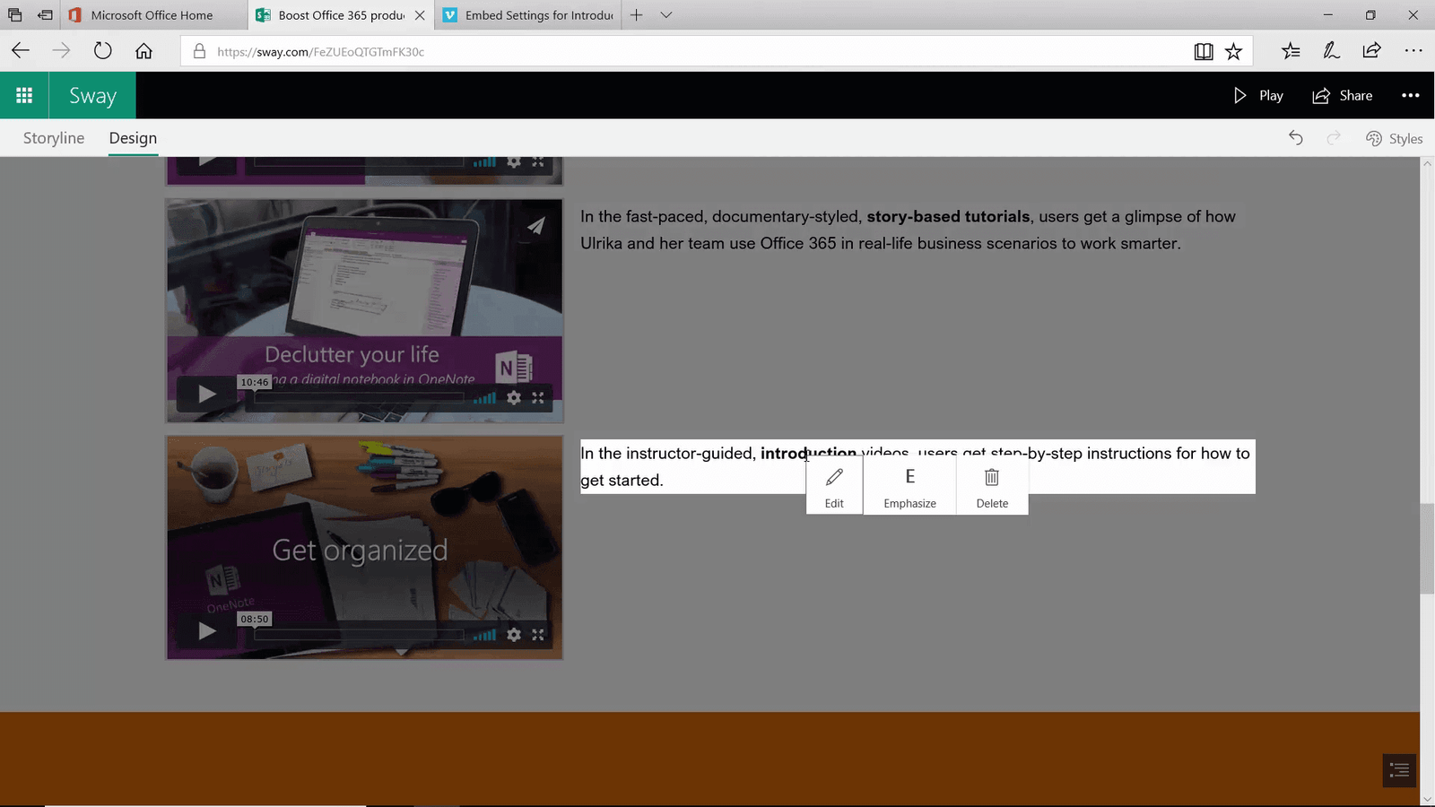
While I’m reviewing the content in Design mode, I want to do some changes. Instead of going back to the Storyline view, I can make minor changes directly from here. To edit content in Design view, mark the content and select what you want to do.
I’ll click “Edit” to change the text. The changes are saved back to the Sway. I’ll mark another piece of text and change the emphasis to Moderate.
Adding a form
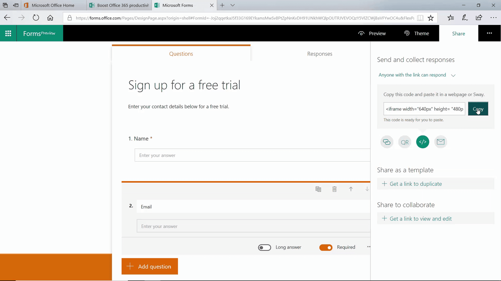
Now I want to add a form so people can sign up for a free trial. To create a form, go to the Office 365 home page and open up Forms in the App Launcher. Click “New Form” and add a title and if desired, a short description.
Next I’ll click “Add question”. I get to select type of input, and here I’ll just select Text and write “Name”. I’ll make this a required field. I do the same for the email. Next I click “Theme” to change color.
Here, you can upload your own background picture. I go back to my Sway, open the Snipping tool and take a screen clip of the white and orange and save it to my computer. I go back to Forms and upload the image. The image is uploaded and the colors applied. There, now the form looks much better. I click “More options” and then “Settings”. I make sure that the “anyone with a link can respond” option is selected and then I select to get an email notification as soon as someone fills out the form. I click “Share”, click the embed icon and “copy” to get the embed code.
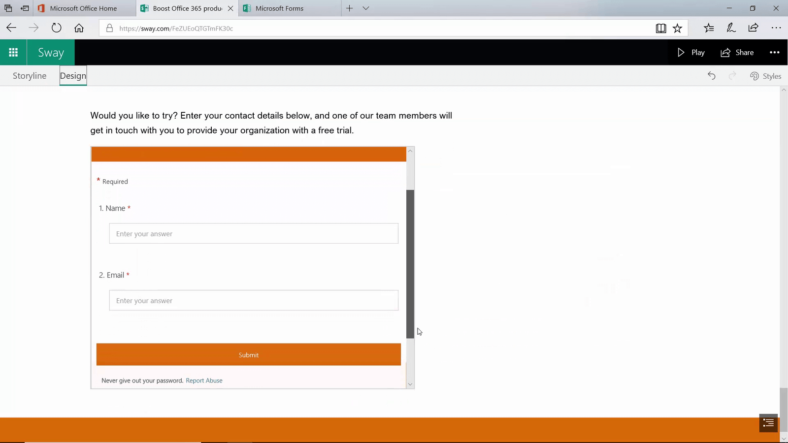
I go back to Sway, click the plus sign, select Media and then “Embed” and then I paste in the code. I select “original size” to make sure the form is displayed properly. I click Design to preview the form. Wonderful! That looks good!
Collaborating on a Sway
Now I’m ready to share it with the team. To share your Sway click “Share”.
Here I’ll select “Anyone with a link” since Carrie is an external business partner. I’ll select edit and then copy the link and share it.
When Carrie clicks to open the Sway, she is required to log in with a Microsoft account.
We meet online and discuss the Sway while we work on it together.
Carrie points out that we should remove the Sway footer. To remove the Sway footer, click “More options”, “Settings for this Sway” and then unmark the checkbox “Show Sway informational footer”. The footer is removed from our Sway.
Kristina adds a final image to the Sway from her mobile.
There, now we are done! Now it’s time to share it with the world.
Sharing the Sway
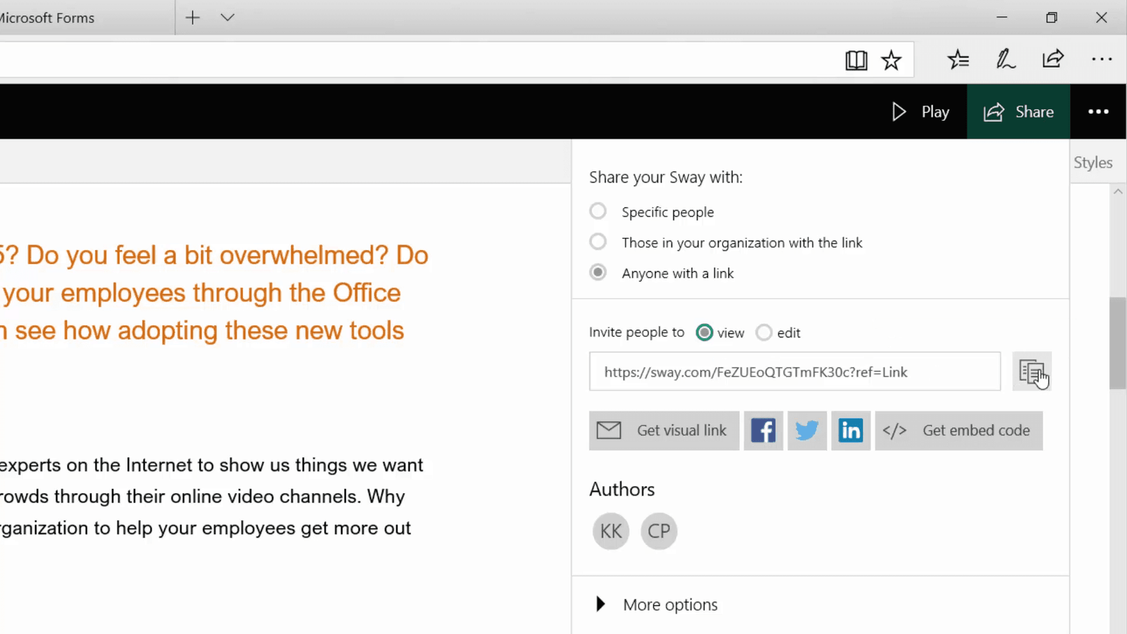
To share your Sway with anyone, click “Share” and then make sure “Anyone with a link” is selected and that the “view” option is marked.
Now you can copy the link to the Sway and share it in multiple channels. To get a link that looks more appealing, click “Get visual link” , “Copy” and then paste the link into an email or chat.
We share the Sway in all our channels.
Editing a shared Sway
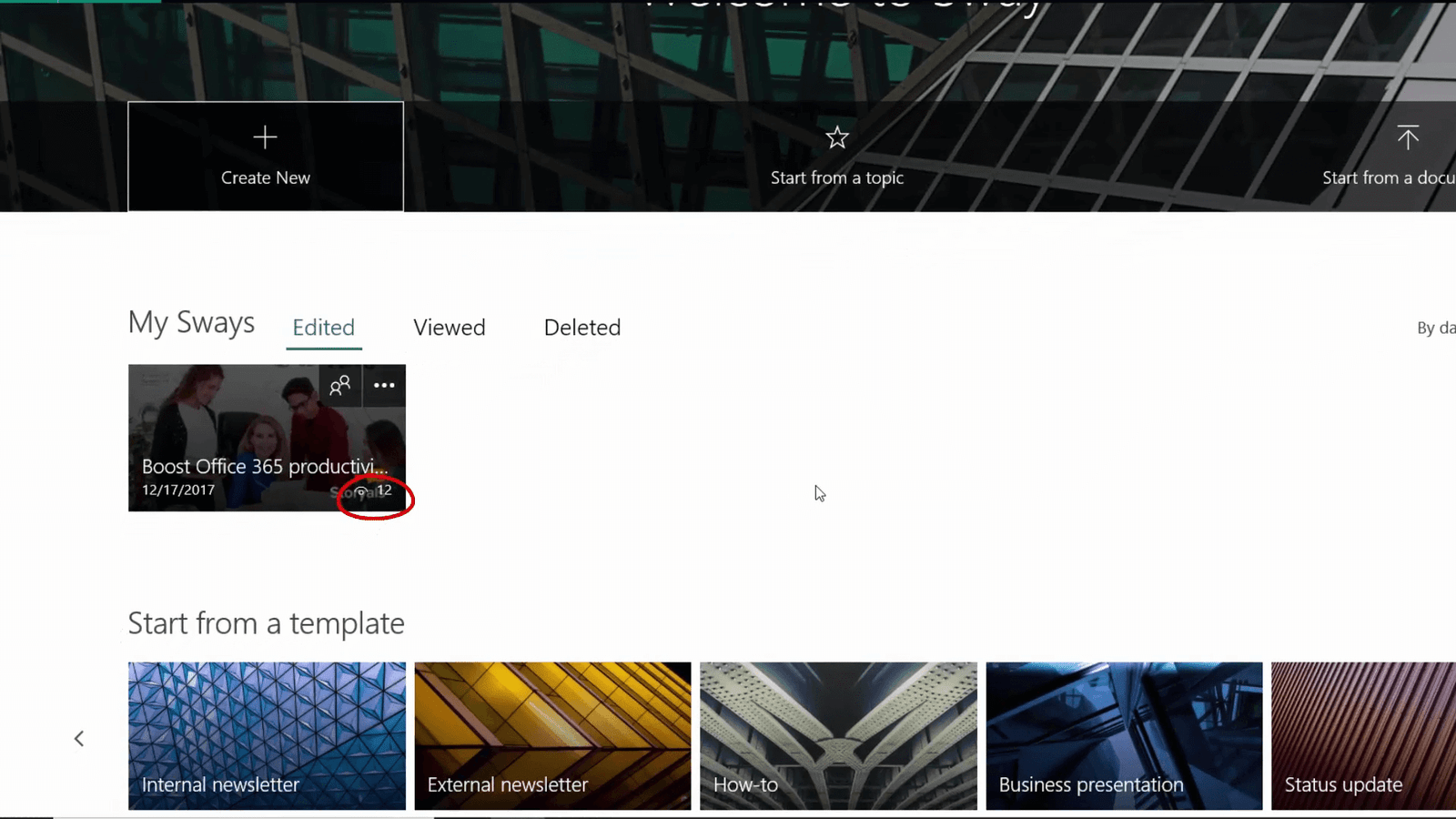
An existing customer who sees the Sway recommends that we add some testimonials. The beauty with Sway is that you can make changes even after you shared it. When I go to the Sway starting page, I can see how many have already seen the Sway by the view count.
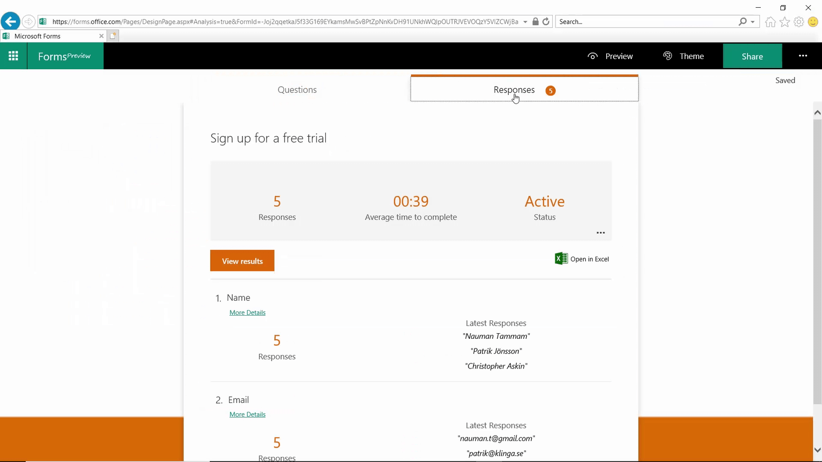
I open the Sway to edit it, I add the quotes, the changes are automatically saved. I can also see that a number of people have signed up for the trial. I open Forms, and click to view the responses.
I want the sales team to follow up on these so I click Share, and then copy an edit link that I share with the sales team. There, thanks to Sway we were quickly able to share our story in a modern , eye-catching manner and better follow up on leads.


