How to use Quick Analysis?
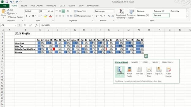
To use the Quick Analysis tool, mark the data you want to visualize. A little Quick Analysis icon appears in the bottom right corner, click it to see the various analysis options available. Under the first “FORMATTING” tab, you can select data bars that show little bar charts within each cell, you can also select conditional formatting that colors cells based on their value relative to each other.
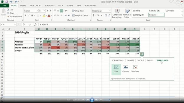
Here I’ll select the “Color Scale”. I also want to show each month’s average so I’ll click the Quick Analysis button again and select “TOTALS” and then “Average”, now the average for each month is displayed under my table.
Finally, I want to show the trend using Sparklines. I’ll go to the “SPARKLINES” tab and select a line chart. As you can see tiny little line charts are inserted next to my table showing the trend over time.


