Design your own presentation theme
Introduction (00:04)
PowerPoint 2013 comes with a number of new themes that you can use for your presentation but quite often you are going to want to use your own corporate theme. In PowerPoint 2013 there is a new coloring tool called the “Eyedropper” which makes it much easier to pick the exact color from your logo and add it to your presentation design. Now I’ll show you how you can use the “Slide Master” and the coloring tools to create your own professional corporate design.
Overview of final theme (00:36)
Here I have the beginning of a company meeting presentation where no corporate theme has been applied. I want to create an attractive corporate theme that I can use so that the presentation will look like this.
On the title slide I want our corporate logo, and throughout the presentation I want to use our corporate fonts and colors.
Built-in themes in PowerPoint 2013 (00:58)
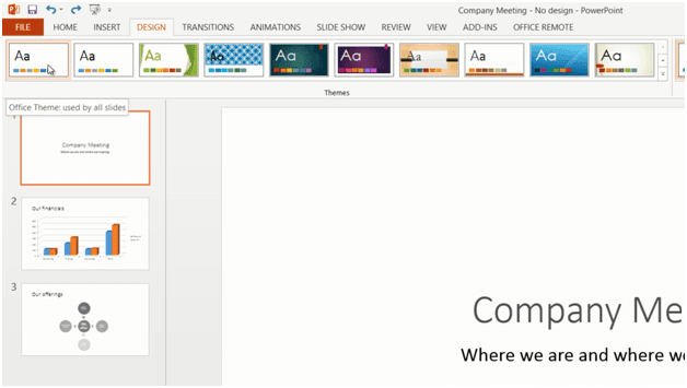
Every time you create a new presentation in PowerPoint 2013 you are presented with numerous themes that you can use for your presentation. You can preview the theme and try different color layouts and you can click to see what various slides in the presentation would look like using the theme. If you like one of these themes you can use it as a starting point for your own corporate design. In this case I’m going to start from a blank design. I’ll click on the “DESIGN” tab to see the starting point. Even though I’ve created a presentation using a blank design it actually uses a theme called “Office theme”.
Creating your own theme by editing the Slide Master (01:38)
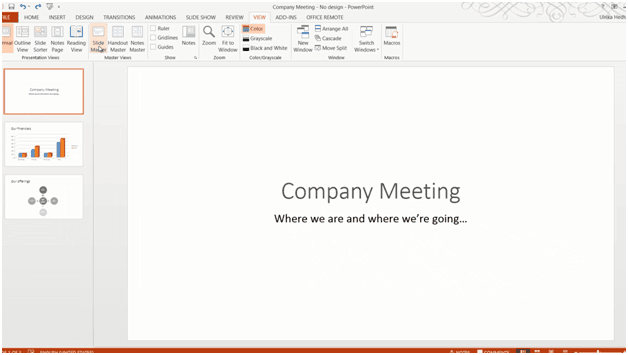
To create my own corporate theme I´m going to open up the “Slide Master”. To open up the “Slide Master”, go to the “VIEW” tab, and then click “Slide Master”.
You can think of the “Slide Master” as the backbone of your presentation. Whatever changes you make to the “Slide Master” will be applied to your presentation.
In PowerPoint 2013 the default slide layout is “Widescreen”, if you normally use a projector that doesn’t support “Widescreen” you can change the layout to “Standard”.
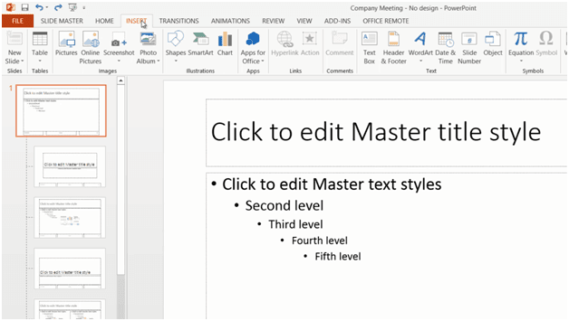
The Slide Master contains a number of different Slide Layouts. This one is for the Title slide, this one for the Content slide and so on. I’ll go to the top slide which is the Master slide.
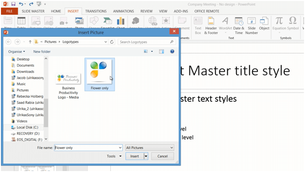
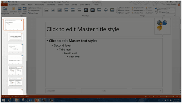
Whatever I apply here will be replicated to all other slide layouts. I’ll click “Insert”, “Pictures” and then select our company logo flower.
I’ll place the flower in the top right corner of the Slide Master. As you can see automatically all of the different slide layouts are updated.
Using shapes in your design (02:47)
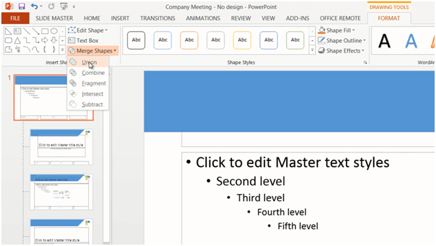
Next I want to add an orange background shape behind the title. I’ll click “INSERT”, “Shapes” and select a rectangle. I’ll draw a rectangle at the top of the slide, I’ll click “Shape Outline” and select “No Outline”. Next I’ll insert a Right-triangle. I’ll hold down the “Shift” key as I draw it to make sure to keep two angles at 45 degrees. Again I’ll click “Shape Outline” and select “No Outline”. I’ll click “Rotate” and select “Flip Vertical”. I need to position the triangle perfectly and the new alignment guides in PowerPoint 2013 help me do that. Now I want to merge these shapes into one so I’ll mark both shapes and on the “DRAWING TOOLS”, “FORMAT” tab I’ll click “Merge Shapes” and then “Union”.
Picking your corporate color using the Eyedropper (03:35)
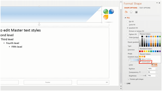
Now I want to change the color of my newly created shape so that it goes in line with the colors of our logo. I’ll Right click and select “Format Shape”. In the “Format Shape” pane, I’ll expand the “FILL” option. Instead of using the “Solid fill” I’m going to choose a “Gradient fill”. I’ll leave it as a “Linear” gradient. I only need to have three gradient stops so I’ll just mark one and click delete, then I’ll move the second one more towards the middle. I’ll mark the first gradient stop, click the color icon but instead of selecting one of the suggested colors I want to pick a color from our logotype. In PowerPoint 2013 Microsoft has introduced the “Eyedropper” so that you can easily apply colors that you have elsewhere in your slide.
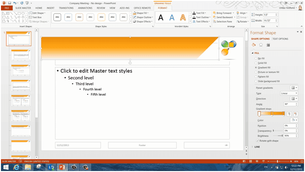
I’ll click the “Eyedropper”, and as you can see my mouse pointer turns into a little dropper with a color square and a text box showing me the unique color combination for that color. Here I’ll pick a dark orange color and click. I’ll do the same for the second “Gradient stops” picking a medium orange color and finally I’ll click on the third “Gradient stops” and select a light orange color. Okay! Now I’ll just close down the “Format” pane.
As you can see, the shape is covering the title, so I need to send the shape back. I’ll right-click and select” Send to Back”. Then I’ll just move the text box and resize it a bit so that it’s better aligned to my shape. To change the color of the title I’ll go to the “HOME” tab and in the Font section I’ll change the color to white.
Changing fonts (05:17)
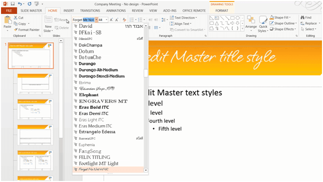
Now I want to change the font of the title. You can easily see what different fonts would look like using the Live preview. To match our corporate identity better I’m going to use a font called “Forget me not” that we have in our logotype. This font isn’t included in Windows by default.
You can purchase and download fonts from a number of sites online. I normally use a site called MyFonts.com where you can easily search for fonts based on certain criteria.
It’s important to note that in order for these fonts to display correctly in your presentation they fonts need to be installed on the computer. So if you send the presentation to someone who doesn’t have the font type installed, it will be replaced by another font.
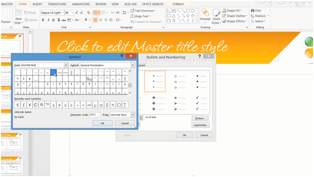
Now I want to change the font for the slide text as well. I’ll mark the text and here I’ll select a built in font called “Segoe UI Light”. I also want to change the first level bullet. I’ll place my marker on the first row, click “Bullet”, “Bullets and Numbering” and then “Customize”, and then I’ll just select a simple dash and click “OK” twice.
I want the title slide to have a different look and feel so that it looks like this.
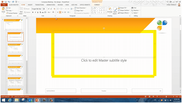
First I’ll change the title color by marking the title text box and on the “HOME” tab I’ll change the font color to a dark grey color.
I’ll also make it a bit smaller by clicking the “decrease font size” button. I’ll click the “Slide Master” tab and in the Background section I’ll mark the option to “Hide Background Graphics”. I’ll insert our full logo by clicking “INSERT”, “Pictures” and selecting our full logo. I’ll resize it by pressing “Shift” on the keyboard while pulling the corner to keep the proportions. I want to have the same orange shape here so I’ll go back the “Slide Master” and copy it by pressing “CTRL C” on my keyboard. I’ll paste it in by pressing “CTRL V”. I’ll just resize it a little bit for the title slide. Now I need another orange shape for the bottom. I’ll click “INSERT”, “Shape” and again select a rectangle, I’ll draw it at the bottom of the slide. To copy the same color formatting of the top shape, I’ll mark it, go to the “HOME” tab, and click “Format Painter”. Now I’ll just point to my shape to copy the formatting. There!
Now we can close down the Master View to see what this presentation looks like. To close the Master View, click the “SLIDE MASTER” tab and then “Close Master View”. There! Now the presentation looks much better!
Changing the color theme (07:50)
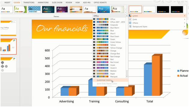
The final thing I have to change is the color theme. To apply a new color theme to a presentation click the “DESIGN” tab and in the “Variants” drop down select “Colors”. Here I can select among a number of pre-defined color combinations with colors that work well together. Here I can also choose to create new theme colors.
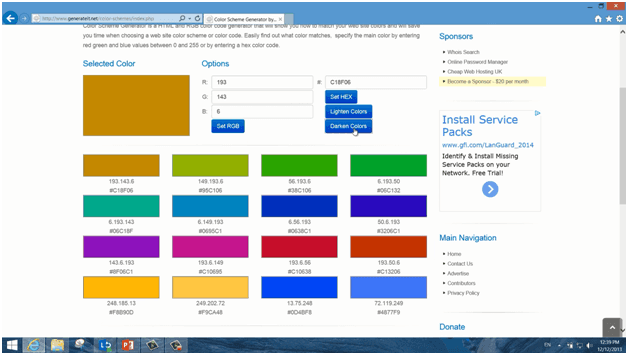
I’m going to change these colors, and again, I want colors that work in harmony with the orange color that is dominating the slides. You can find tools online that help you find matching colors. Here I have a site called “Generateit” where I have entered our orange color and it is giving me colors that go in harmony with that. I’ll just choose to darken the colors a bit and then I’ll note them done.
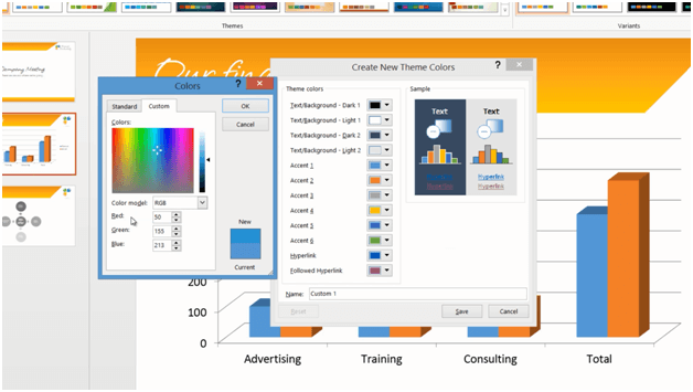
I’ll click the first “Accent” color but unfortunately I don’t have the “”Eyedropper” here so I’ll just have to enter the RGB codes of the colors from the site for each of the “Accent” colors manually.
When I’m done with all the colors I’ll give the color combination a new name, “Corporate Colors” and save it. There! To apply this color combination to the Slide Master I’ll open up the “SLIDE MASTER”, click “Colors”, right-click my newly created color combination and click “Apply to Slide Master”.
Saving your theme (09:10)
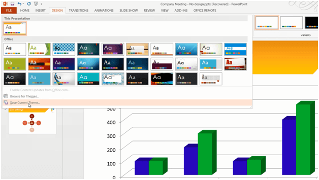
There! Now that I’m happy with the corporate theme I’ll close down the Slide Master and save the theme. To save a theme that you’ve created, click the “DESIGN” tab, open up the design theme gallery, and choose “Save Current Theme”.
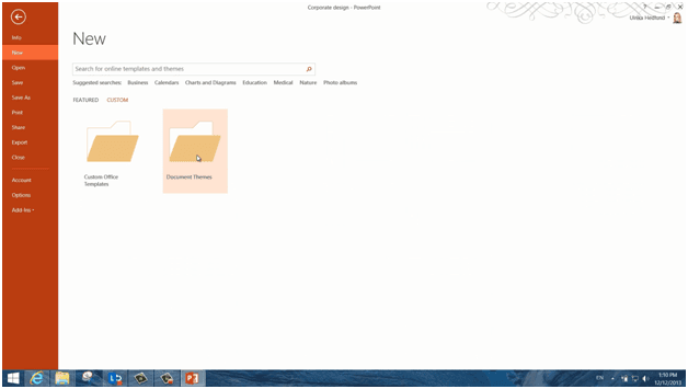
I’ll give it a name “Corporate Theme” and then “Save”. Now I have the corporate theme design saved in the design library and I can easily apply this to any new presentation I want to create. Every time I create a new presentation I can access the theme by clicking “CUSTOM” and then selecting “Document Themes”.
If you click the little pushpin next to your theme, it will be available on the first page every time you create a new presentation.
There now in less than ten minutes I have created an attractive corporate PowerPoint theme.


