Create an informative report using PivotTables
Learn how to create a report using PivotTables in Excel 2010
Introduction (04:00)
Welcome to Business Productivity – I’m Ulrika Hedlund. In the video “Create a PivotTable to analyze your data” I show you how you can use PivotTables in Excel 2010 to analyze data. PivotTables are great for moving data around to see it from different perspectives. Many times you need to share your analysis with other people and in that case it’s great if you structure the data into a report and format it in a way that’s easy for others to understand. The benefit of sharing a digital report instead of a paper report, is that readers can engage with the content.
In this video I’ll show you how you can create a report from your PivotTable analysis. I’ll show you how you can group fields into logical categories, such as countries into regions. I’ll also show you how you can add buttons, or so called ”slicers” to your report so that the reader can easily switch between different views, I’ll also show you how you can use conditional formatting to highlight numbers that stand out. Let’s get started!
Insert a PivotTable (01:15)
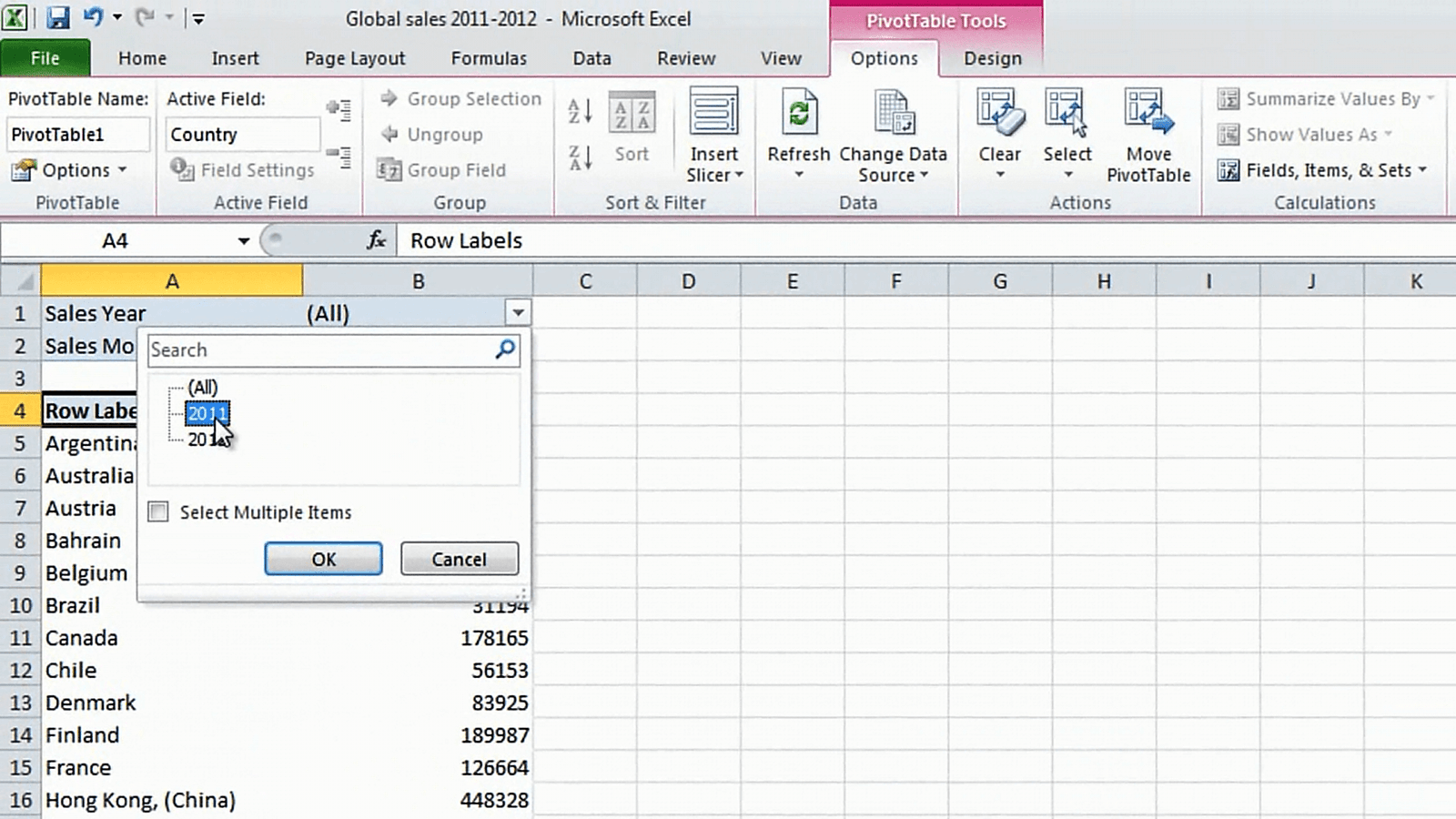
Here I have an Excel spreadsheet showing global sales for 2011 and year to date 2012. Now I want to create a summarized report for the sales 2011 and I’m going to use PivotTables to create this report. The first step is to insert a PivotTable. Click “Insert” and then select “PivotTable”. We’ll just select to put it in a new worksheet and I’ll click “OK”. In this first sheet I want to show the sales for each region in each country. I’ll select “Country” as a Row Label and then “Sales Revenue” as the value. I’ll select “Sales Year” and “Sales Month” for the report filter and here I’ll select only to show sales 2011 and then I’ll click “OK”.
Change the number format for easier reading (02:03)
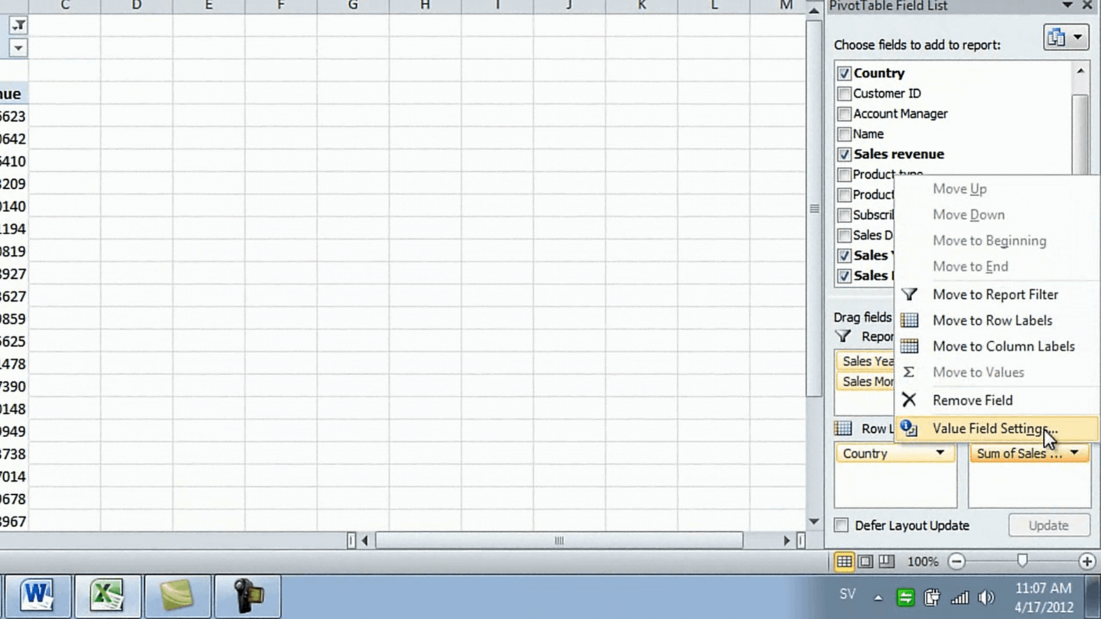
To make this report a bit easier to read I’m going to change the number format of the revenue. I’ll click the “Sum of Revenue” and select “Value Field Settings”.
Here I’ll select to write a custom name [Sales ($)] and then I’ll change the number format to “Number”, select to have a 1000-separator and then remove the decimal places and then click “OK”. There now the numbers are much easier to read.
Create your own grouping of fields (02:33)
The next thing I want to do is to organize these countries into regions. Unfortunately I don’t have “Regions” as a selection in my Field List so I’m going to have to group countries into regions myself. To do this we’ll mark the countries that belong to a region. So I’ll select “Argentina” and then I’ll hold down the control key to select multiple countries and then I’ll mark “Brazil” and “Chile” and then I’ll select “Group Selection”.
I can rename the group and I’ll just name this “South America”. Now I’ll do the same thing for Europe. I’ll select “Austria”, hold down the control key, and then select each country that belongs to the Europe region. In order to scroll down I have to release the control key and then I’ll press it again to mark the remaining countries in Europe. I’ll select “Group Selection” and I’ll rename “Group2” to “Europe” and then I’ll just do the same thing for the other regions. There now I have all of my regions now I just want to change the order. I’ll select “Asia”, right-click and say [click] “Move to the Beginning”.
Then I’ll select “South America” right-click and say [click] “Move to the End”. There, now I have a good order of my regions. Now I’ll just change the name “Row Labels” and write “Region/Countries and then I’ll change the name of “Country2” by clicking “Field Settings” and here I’ll write “Region”.
Add a design to your PivotTable (04:15)
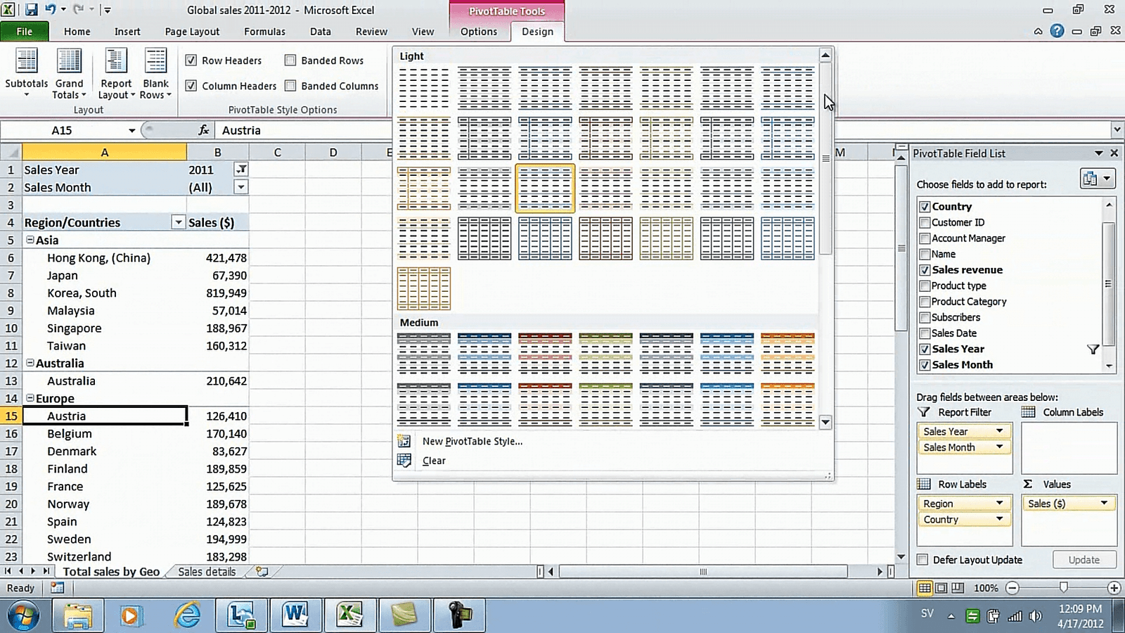
Okay, now we’ll just rename this sheet by right-clicking and selecting “Rename”. I’ll name this “Total Sales by Geo” and then I’d like to add a nice design. I’ll go to the “PivotTable Tools” and click “Design” and here I can select among the many styles available in the style gallery. I’ll select a dark design that’s blue and grey.
Automatically generate sheets to show perspectives (04:37)
In this sales report I also want to show sales for each month. I have the “Sales Month” as a filter here so you can go and just select a month, but I want this to be easier so I want to place each month as a sheet in my report. To do that automatically, go to the “PivotTable Tools” tab and click “Options”. Here, under the “PivotTable Options” select “Show Report Filter Pages”.
Here I can select which filter I want to create pages of and I’ll select “Sales Month” and then just click “OK” and as you can see in an instant Excel created a sheet for each month, keeping the design that I’ve created.
Highlight numbers that stand out (05:17)
Now I want to create one more sheet that shows all of the months in one page. I’ll go to the “Total Sales by Geo”, right-click and select to copy. I’ll create a copy and click “OK”.
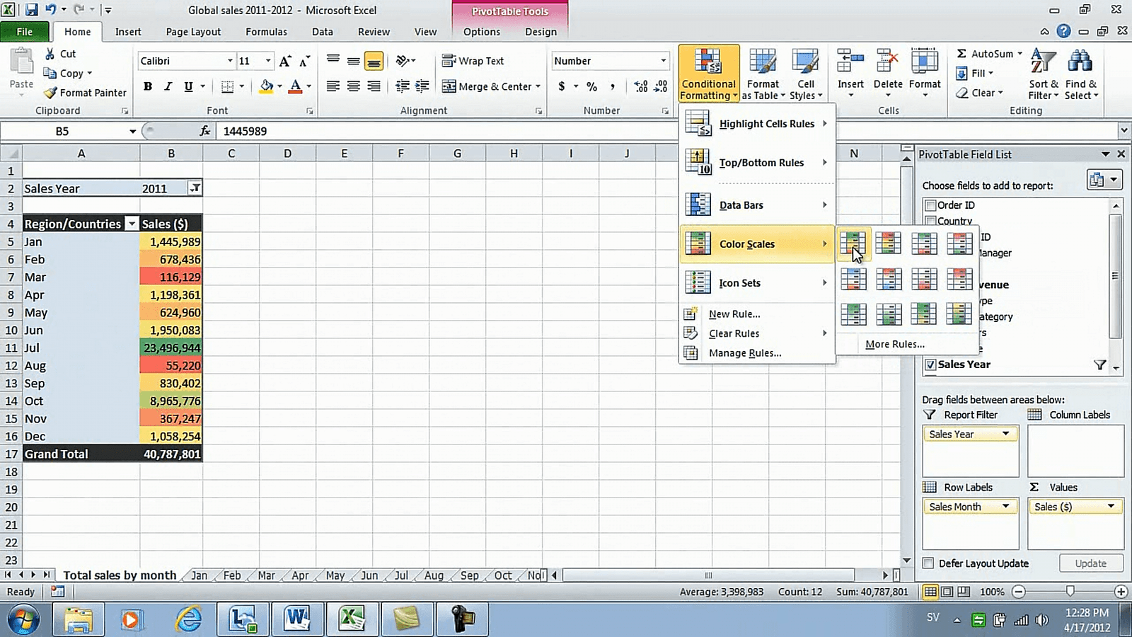
I’ll rename this to “Total Sales by Month”. I’ll remove the “Region” and the “Country” and instead move the “Sales Month” to the Row Label. Now I want to add some colors to these numbers to highlight the difference. I’ll mark the numbers and then click the “Home” tab. Under “Styles” click “Conditional Formatting” and here you can select among a number of different styles. You can select data bars that will show you data bars across the numbers, but in this case, since the difference in numbers is so large I’ll select a “Color Scale”.
I’ll select the first one which highlights large numbers in green and small numbers in red. Now it’s really easy to see the months that we sold the best as well as the months that we didn’t sell as much.
Add a slicer to facilitate filtering (06:23)
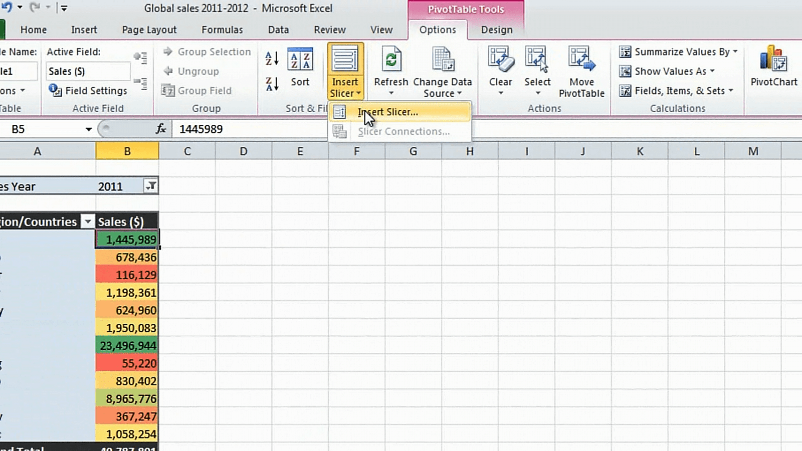
To this view I’d also like to filter on Account Manager. What I can do is add the “Account Manager” field to the report filter and then you can just select the account manager. But I’d like to make it a little bit easier so I’m going to remove this from here and instead I’m going to insert a slicer. To do that click “Options” and select “Insert Slicer”,
Here I’ll select the “Account Manager” and click “OK”. Now I get a nice box with buttons for each account manager. I’ll resize the box so that all names are visible. I can also change the displayed heading. Just mark the slicer and click “Slicer Tools”, “Options”. Click “Slicer Settings” and choose to write a new caption for the “Display header” and I’ll just type “Filter on Account Manager” and click “OK”. I’ll make this a little bit larger and now you can see that you can easily just click on a button to filter on the account manager.
To clear the filter just click “Clear Filter”. Adding slicers is a great way for you to add flexibility to your report so that the reader can see the information that they are looking for.
Closing (07:42)
It’s always much more difficult to make sense of someone else’s data. So if you are to share your PivotTable analysis with someone else I strongly urge you to go through the steps of making a report that is easy to read and understand. It will also help you if you need to go back and look at a later stage. I’m Ulrika Hedlund for Business Productivity – thanks for watching!


