An introduction to Office 2013
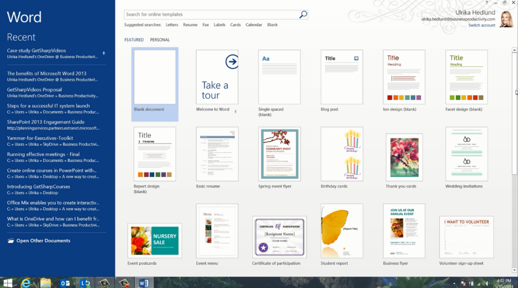
The new start screen in Office 2013 helps you get started quickly. Here you are presented with a rich set of templates to give you inspiration.
You can also access one of your own templates, or open up a recent document you’ve been working on or a document that you have pinned for easy access. To start from scratch select the blank document.
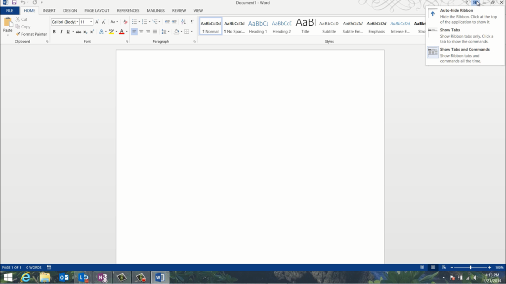
The new interface of Office 2013 is cleaner, with less clutter, giving more focus to your work. You still have the familiar ribbon, with contextual menus. You can change the appearance of the Ribbon to show exactly how much you want. Click on the ribbon display icon to select between a minimized layout where you only see the tabs, or the full view with all tabs and commands.
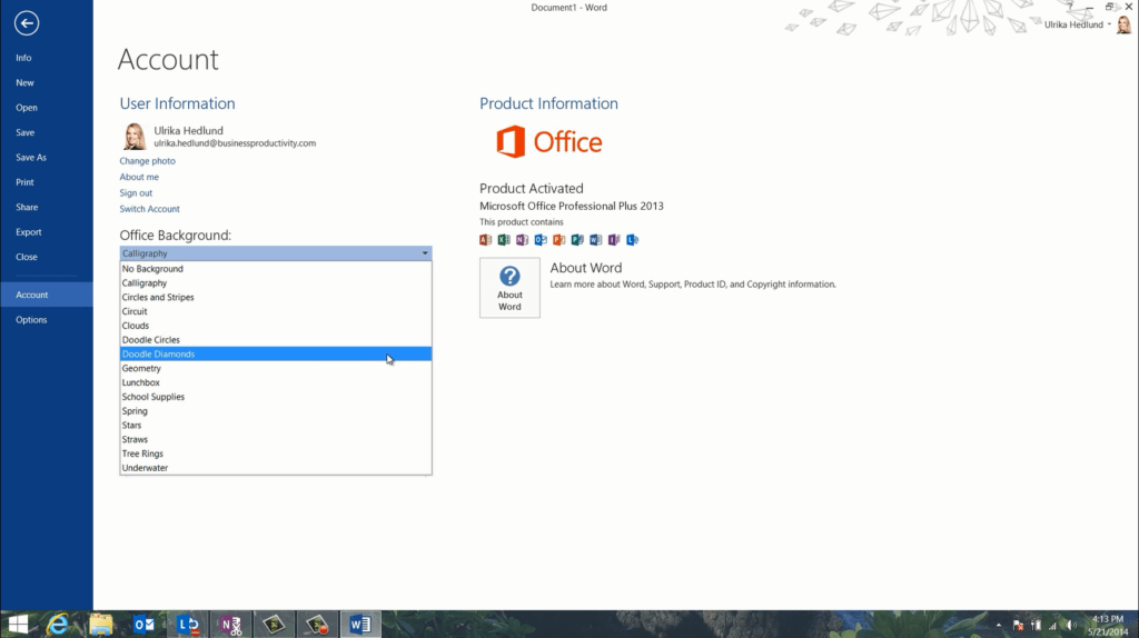
Office now provides you with a more personal experience. By going to the account tab you can personalize the look and feel of your Office. Here you can change between a number of different Office backgrounds, the Live Preview shows you what they look like.
You can also select theme color. These settings, along with your recent documents, stay with you wherever you log in to Office.
Office 2013 has been designed to work with a number of different devices, including devices with touch screens. If you are using Office on a touch screen device the layout is changed so that there is more space between menu items, you can easily switch between mouse and touch mode for an optimized experience.
Office 2013 encourages you to save files to the cloud using SharePoint or OneDrive. By saving your documents to the cloud they are securely backed up, you can easily share and collaborate on your documents with others. You can also access your Office documents from any browser using the Office Web Apps or from your Smart Phone.
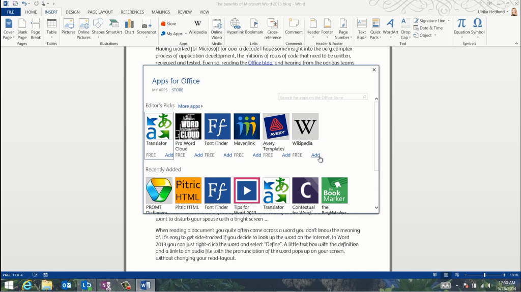
You can extend the functionality of Office 2013 further by inserting apps from the Office Store. Here you can select between numerous apps that provide additional, innovative functionality to the various Office applications.


