Spice up your charts
Learn how to modify and format charts in Microsoft Excel 2010
Introduction (00:04)
Welcome to Business Productivity, I’m Ulrika Hedlund. If you have a report in Excel with charts that you want to share with others, you might want to spend some time to design your charts so that they’re easier to read and so that the report looks more professional. There are countless options in Microsoft Excel 2010 to design your charts. And even though I wouldn’t recommend that you spend hours and hours fine-tuning your charts, a few modifications might be good.
In the video “Visualize your data with basic charts” I show you the basic steps for how to insert charts into your report and make some common modifications. In this video I’ll take it one step further. I’ll show you how to change the background colors and add images to your charts, how to make your charts look smoother and more appealing for the eye. And also how to save your chart designs as templates so that you can reuse them over and over again. Let me show you!
Show hidden data in your charts (01:07)
Here I have a spreadsheet with basic charts. I want to spice up this report so that it looks like this:
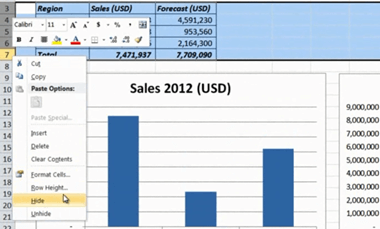
First I’ll hide the table; I’ll mark the rows, right-click and select “Hide”.
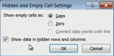
But as you can see the charts disappear when I do. To show the data in hidden cells I’ll go to the “Design” tab and click “Select Data”.
[Click] ‘Hidden and empty cells’ and here I’ll check to “Show data in hidden rows and columns”.
I’ll click OK. And then I’ll do the same thing for the second chart to show that as well.
Clean up your charts (01:43)
Now I’d like to clean up the charts a bit to make them easier to read. I’ll mark this first chart, go to the “Design” tab, “Chart Layouts”, and select a new layout.
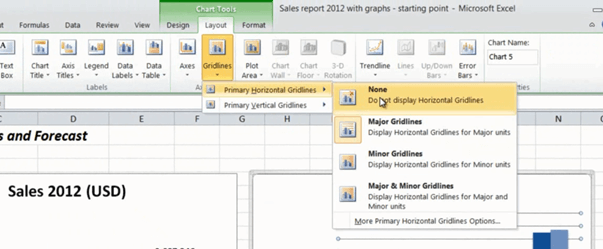
I’ll remove the legend and then I’ll go to the Chart Styles gallery and select a 3D design. I’ll mark the second chart and select a data table layout that shows the actual numbers underneath each column. I’ll clean it up by hand by deleting the vertical axis and remove the gridlines by going to the “Layout” tab, “Gridlines”, “Primary Horizontal Gridlines” and select “None”.
There! No I’ll just change the style to 3D style.
Change the background color of your worksheets (02:28)
Now I want to add a background color. To do that I’ll click the top left corner and then change the fill color to a light grey.
To change the background color of all the worksheets in the report I’ll mark all the worksheets by pressing “Shift” [on the keyboard] and then clicking on the last worksheet. Again, I’ll click the top left corner and select my fill color. Now the background color has changed for all the worksheets.
Add pictures to your report (02:57)
Now I’d like to add our logo. I’ll move the title a bit and then I’ll go to the “Insert” tab, “Picture” and select our logo. I’ll resize it by grabbing the bottom right corner while holding down the “Shift” key [on the keyboard] to keep the proportions of the logo.
Change theme colors (03:15)
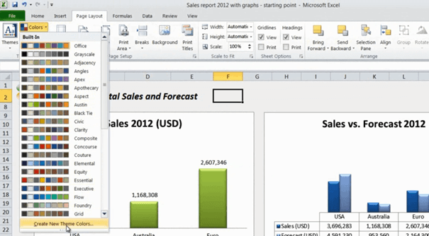
I’d like to change the color of this first chart to a dark green that works well with our logo. I think the green that is available here in the gallery is too light. Instead of changing the color in the chart itself I’ll change the color theme of the spreadsheet. To do that I’ll go to the “Page Layout” tab and select “Colors”. I’ll scroll down and select to create a new theme [Create New Theme Colors].
Here I’ll select the light green color and change it to a darker green. I’ll name the theme ‘Business Productivity’ and save it so that I can reuse it in other spreadsheets. There! That looks much better.
Give your charts a nice design (03:56)
In the ‘Sales vs. Forecast’ chart I want to change the color of the columns to highlight that we didn’t meet our forecasted sales in the USA and overall in total sales. I’ll click the forecasted sales column for the USA; this selects all the columns in the series. I’ll click again to only select the column for the USA. In the “Format Data Point” window I’ll click “Fill” and select a “Gradient Fill”. Here I’ll add an additional gradient stop and change the color of the first gradient stop to a dark red.
I’ll move the gradient marker so that the red is only showing the gap. Now I’ll do the same thing for the total forecast column. Here I’ll move the gradient stop a bit more to highlight the gap in total sales. There! That looks great!
Finally I’ll add borders to my charts by going to the “Format” tab and selecting an outline color for each of the two charts.
Modify your bar charts (04:57)
In the second worksheet where I have ‘Total Sales by Account Manager’ I want to change the look and feel of the chart so that it looks like this:
I’ve already changed the background color of the worksheet to grey but to make the table easier to read I’ll mark it and change the fill color to white. I’ll do the same thing with all the tables in my spreadsheet. To change the design of the chart I’ll mark the chart go to the “Design” tab and select the 3D design with the black background. To make the bars a bit thicker I’ll double click on a bar to open up the formatting window and then I’ll pull the slider to make the gap width between the bars smaller.
There! That’s perfect!
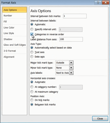
Now as you can see the names in the bar chart are in the opposite order of the names in the table. This is the way Excel creates the chart. But I want to change it. To do that I’ll double click the vertical axis and check the option for “Categories in reverse order”.
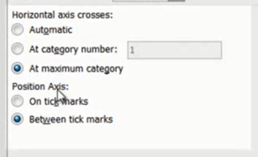
When I do this, the horizontal axis moves to the top, so to keep it at the bottom I’ll change the horizontal axis option to “At maximum category”.
I’ll close this down and go to the next worksheet.
Design your pie charts (06:14)
Here I have a pie chart that I want to spice up in 3D like this one here:
I also want to highlight the better margins in the Euro area. First I’ll mark the chart and under the Chart Tools “Design” tab I’ll click “Change Chart Type”.
Here I’ll select the 3D chart. I can change the 3D settings by right clicking the chart and selecting 3D-rotation. If you change the X rotation you will turn the pie around. If you change the Y rotation you change the angle. So click until you find an angle you like. I’ll close this down and I’ll mark the Euro piece of the pie by clicking the pie and then the Euro piece and then I’ll just pull it out. There! Now I’ll go to the “Insert” tab, “Shapes”, and select a star shape.
I’ll insert the star next to my chart. I’ll change the style and then I’ll copy the star and move it to the bottom of the chart. To insert text I’ll go to the “Insert” tab again and select “Text Box”. I’ll draw a text box under my chart and then I’ll add my text ‘Best margin’, I’ll mark the text and change it to italic. Okay!
Smoothen your line charts (07:39)
Let’s go to the next worksheet. Here I have a line chart that I want to make a bit smoother like this one here:
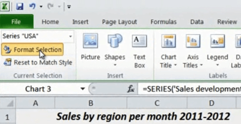
To do that I’ll click one of the lines to change the formatting. If it is difficult to click on the line itself you can mark the chart and go to the Chart Tools “Layout” tab and select the series in the drop down box.
Then just click “Format Selection”.
Under “Line Style” check the box for “Smoothed line”. I’ll do the same for the other lines as well. There! Now the chart looks much better!
Design your sparklines (08:17)
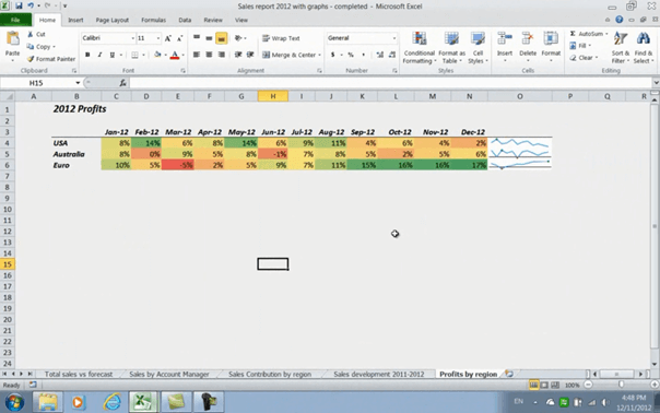
In this last worksheet I want to add some more emphasis to my sparklines and add some more color to my table, like the one here:
To do that, I’ll mark the sparklines and when I do, the “Sparkline Tools” appear. I’ll go to the “Design” tab and in the “Show” section I’ll select to show the high point and negative points. Under the “Group” section I’ll click “Axis” and select “Show Axis”.
I’ll click “Sparkline Color” and select a light blue color and then I’ll click it again to increase the width of the line. I’ll click “Marker Color“ select the “High Point” and change the color to green. There! Now they’re easier to read. Finally I’ll mark the table and on the “Home” tab in the “Style” section I’ll select “Conditional Formatting”, “Color Scales”, and then I’ll select the style that makes high numbers green and low numbers red. There, now I’m done with my sales report and I’m ready to share it with my team!
Ending (09:20)
As you can see, there are lots of options to change the default layout of your charts in Microsoft Excel 2010. By following the steps in this video I’m sure that you’ll be able create a great looking report. I’m Ulrika Hedlund, from Business Productivity – Thanks for watching!


