Streamline your presentations with a consistent corporate design
Learn how to use design templates in PowerPoint 2010
Introduction (00:03)
Welcome to Business Productivity. I’m Ulrika Hedlund. Having a consistent look and feel across your company presentations is really important if you want to be seen as a professional business. In PowerPoint 2010, there are a number of built in themes that you can use. But if you want to have your own unique brand identity I really recommend that you create your own.
In the first part of this video I’ll show you how you can create your own design, I’ll show you how you can pick colors from your own logotype to use in the design. In the second part of the video I’ll show you how you can add new fonts to PowerPoint and also how you can save a design using multiple colors. Let’s have a look!
Part 1
An overview of the built-in themes in PowerPoint (00:47)
Before I show you how to create your own design I’d like to give you an overview of how themes work in PowerPoint. If you go to the “Design” tab you will see a number of themes in the theme gallery.
The design theme determines the look and feel for your PowerPoint presentation; the background colors, the font that’s used, the colors of the objects, the layout, basically everything about your presentation.
PowerPoint comes with built-in themes and some of them are quite okay, and some of them are quite horrible if you ask me. So what I am going to show you now is how you can create your own theme in PowerPoint.
The default natural theme (01:29)
The default theme that is used when you open up a new presentation is the Office theme.
And this one is quite neutral. If you don’t like the color combination of a particular theme you can go into the “Colors” tab and you can just change it to one of the built-in color sets.
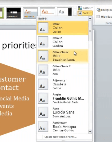
You can also change the fonts that are used in the theme. [Click “Fonts”]
By hovering over with the mouse you can quickly see what different fonts would look like in your presentation. I can save the changes that I’ve done, with the fonts and the colors, into a new theme [Click “More”, then “Save Current Theme”] and I can give it my own name.
But in this case we want to create our own corporate design, so we’re not going to use the built-in themes.
How to insert your logo in your PowerPoint design (02:15)
To create a corporate theme we’re going to open up the “Slide Master”. To do this, go to the “View” tab, and then click on the “Slide Master”.
You can think of the “Slide Master” as the DNA of your presentation. The “Slide Master” determines the background colors, the logos, the fonts and everything that you use in your design. Under the “Slide Master” you have the various Slide Layouts. This one is for the title slide:
This one for the content slide, etc. Now I want to start with our corporate design so I’m going to go to the top one which is the master slide. And I want to insert our logo here. So I go to “Insert”, “Picture”, and I’m going to choose the logo that only is the flower. And I’ll put it down in the right hand corner. And as you can see automatically all of the different pages are updated with the changes that I have done to the master slide.
Create your own background (03:11)
Next I want to insert a different background color for the title. So, again I’m going to go to “Insert”, and I’m going to choose a shape [click “Shapes”], which is the squared shape.
And I’m just going to draw a shape here that covers the title.
And then I’m going to double click it to format the color. I’m going to remove the outline, since I don’t want any outline.
And then I’m going to right click and choose “Format Shape” to change the colors. Now, instead of using the “Solid fill” I’m going to choose a “Gradient fill”.
The gradient fill allows you to have multiple colors or multiple shades of a color in the same shape. It makes it look really nice, I can really recommend this. For the gradient fill you choose a color for each of the gradient stops. You can add more gradient stops if you want to add more shades, or you can remove some of them.
I think the default of having three gradient stops is a good starting point. So I’m going to start with the gradient stop with the darkest color.
How to find your corporate color combination (04:12)
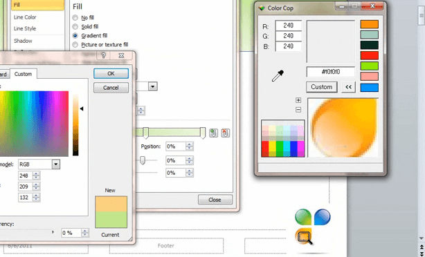
Now, instead of using this green color I want to use the orange shades that I have as a part of my logo. Now, unfortunately, it’s quite difficult for me to just try to find the color if I don’t know exact color combination. Unfortunately, PowerPoint does not come with a color picker. But you can download these online for free. I’ve downloaded one that’s called “Colorcop”, so I’m just going to open up that one and I’m going to pick the exact colors that I have in my logotype.
First I’m going to take the magnifying glass
and I’m just going to put it on top of the logotype.
And then I’ll just click on the darkest orange color. And here I have the combination: 233, 130 and then 32.
“OK”. I’m going to do the same thing for the second stop. But here I want to choose an orange color in the middle. I’ll insert those values. “OK”. And then finally for the third gradient stop I’ll choose a light color. Okay! There we go!
Make sure your text is visible (05:34)
As you can see, now the shape is covering the text, so I need to send the shape back. So I’ll click here and “Send to Back”.
And then I also want to change the font color to white.
Part 2
Create a design with a unique font (00:00)
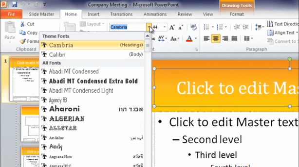
I also want to change the font for the title text. To do that, I go to the “Home” tab and to the theme fonts.
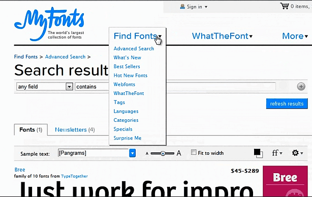
It’s easy to get a quick overview of what the different fonts would look like with the live preview. In this case I want to use a font called “Bree”. This font isn’t included in Office, I’ve purchased and downloaded it from a site called www.myfonts.com.
This is the same font that I use on my corporate website so I want to keep a consistent look and feel for my website as well as my presentations. If you don’t know the name of a font you can easily look for fonts, and I usually look for them using the tags.
So depending of what type of font you’re looking for you can easily find it here.
Remember that you have to buy licenses for everyone in your organization that wants to use these fonts. Now all of the slide layouts in my presentation have the same look and feel, with the white title and the little flower logo in the right hand corner.
Create a different look for the starting slide (01:05)
I want the starting slide to have different look and feel. First of all, I want the title to be in black and then I want to change the design. So to do that I’m going to go back to the “Slide Master” tab and I’m going to choose “Hide Background Graphics”.
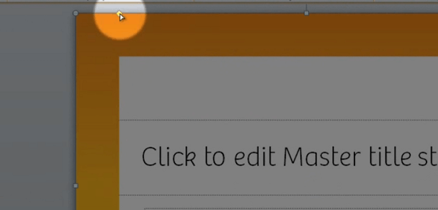
Now I can create another design for this slide. So here I’m going to insert a frame under the “Shapes” tab.
And I’m just going to mark the corner and drag the frame.
And again I want to use the orange colors. So I’ll mark the frame and choose “Format Shape” and go to the “Gradient fill”. So I’ll just enter the same color combination as we had before. One for the dark orange, and then a lighter orange in the middle, and then finally for the last gradient stop a light orange color. Okay! I’ll also choose to remove the line colors so that we have no line. Finally I just want to make the frame a little bit smaller. So I’ll do that by just dragging this yellow diamond to the left:
Okay! Last thing is to insert a different logo. This time I want to insert the logo with a full text. Make it a little bit smaller and then put it up in the left hand corner. There! Now we can close the master view to see what this presentation looks like. Much better!
Change the color theme to fit your own corporate colors (02:45)
The final thing now that we need to change is the color theme. So I’m going to go back to the “Design” tab and choose “Colors” and “Create New Theme Colors”.
Theme colors in PowerPoint are made up of 12 different colors; 4 colors for background and text – 2 dark ones and 2 light ones. You also have 6 accent colors, these colors are used for shapes and shadows. And finally you have two colors for hyperlinks.
I’m going to change these colors, and again, I’m using colors that go in line with our logo that I’ve picked using the Colorcop tool. There! Now I’ll just save this as a new name and “Save”.
And as you can see, the colors in my presentation are now being updated using the corporate color theme that we’ve just created. Okay!
Save your new theme (03:42)
Now that we are happy with the theme we want to save it. So to do that open up the design theme gallery, and choose “Save Current Theme”.
And click “Save”. Now we have our corporate theme design saved in the design library and we can easily apply this to any new presentation that we want to create.
Create a PowerPoint template (04:08)
In addition to saving theme I also want to create a PowerPoint template. Templates are actual files that you can easily send to different people. So it’s an easy way to share your design. But to do that I’m going to remove the information that I have in my PowerPoint and I’m just going to put some empty slides. Go to “File”, “Save as” and choose a PowerPoint Template.
Now, if I want to create a new PowerPoint I can go to “My Templates” and I can just choose the corporate template that I’ve saved.
And there you have it; a streamline corporate design for your PowerPoint presentations!
Closing
I hope that I was able to de-mystify themes and templates and PowerPoint, and that I gave you some ideas of how to create your own corporate design in PowerPoint so that you can streamline your company presentations.
I’m Ulrika for Business Productivity. Thanks for watching!


