Create a PivotTable to analyze your data
Learn how to use PivotTables in Excel 2010 to analyze data
Introduction (00:04)
Welcome to Business Productivity – I’m Ulrika Hedlund. Quite often you need to analyze data by looking at it from different perspectives. For instance, how much did we sell in June 2011? Or how much did we spend this year compared to last? When you’re analyzing historical data you’re looking for trends and inconsistencies and you want to find the underlying reasons. A very powerful tool for analyzing data is the PivotTable in Excel. Using a PivotTable you can instantly see the sum of a range of numbers and you can easily move data around to see it from different perspectives.
In this video we’ll take a look at sales data from 2011 and 2012. We’ll create a PivotTable to understand how much we’ve sold each month, where our largest deals are coming from and how consistent our account managers are in their sales. Let’s have a look!
Introducing the PivotTable (01:08)
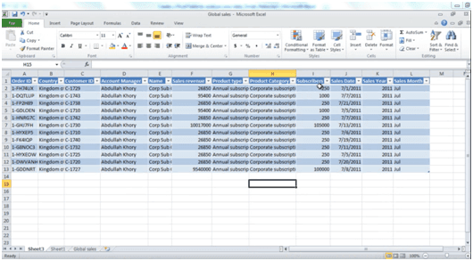
Here I have a list with sales transactions from January 2011 to February 2012. By having them in a list like this I can easily sort and filter to see our largest deals and how many transactions we have. But if I want to start aggregating the data to calculate total sales it can be quite time-consuming if I keep the data in a list. Say for instance that I want to see our total sales in January 2011, or which month we had the largest revenues. In order to do that quickly I’m going to create a PivotTable.
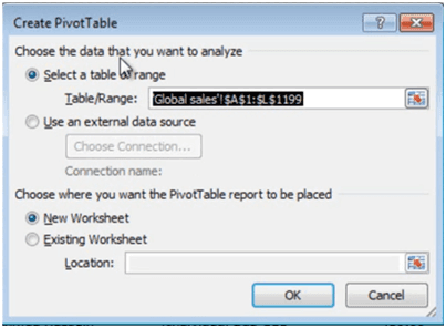
To create a PivotTable, click any cell in the table, click “Insert” and then click “PivotTable”.
Excel selects the table range for you and you can select where you want the PivotTable to be placed. I’ll just leave the default, which is in a New Worksheet and then click OK.
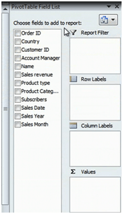
Now I have my PivotTable on the left and my field list on the right.
Changing the layout of the field list (02:04)
You use the field list to select which data you want to see in your PivotTable. If you have a lot of fields and you don’t want to scroll you can change the layout of your field list. So for instance you can select to see the field section side by side. This way you don’t have to scroll through your fields.
But for now I’ll just go back to the default view.
Getting started analyzing data in the PivotTable (02:23)
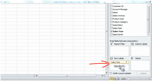
Now the first thing I’d to look at is total sales per month for 2011 and 2012. So to create that PivotTable I’ll first select “Sales Year” and drag it to the Row labels area. Then I’ll select “Sales Month” and put it under “Sales Year”. You can see a little blue line indicating the location.
And then I’ll take the “Sales revenue” that I want to be added and put it in the Values section. Different calculations can be shown in the PivotTable, but since we want to see the total sales amount for each month I’m going to keep the default here which is Sum of Sales revenue.
Make the PivotTable easier to read (03:00)
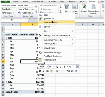
If I look at my PivotTable I instantly get a good overview of the total sales for each month. To make this even easier to read I can change the number format and also the design of the PivotTable. First I’ll change the number format. To do that just right click and select Number format.
Here I’m going to select “Number”, use a [1000] comma separator and reduce the decimal places to zero.
Different ways of displaying subtotals (03:24)
The next thing I want to do is that I want to change how the PivotTable shows the subtotals.
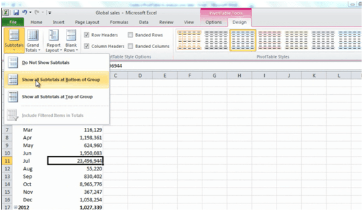
Click the “Design” tab and then “Subtotals”. Here I’m going to select to “Show all Subtotals at Bottom of the Group”. So here you can see that for 2011 I get the 2011 total at the bottom and this is just a personal preference. I think it’s easier to see it this way.
Another thing I’d like to do is to add a blank row underneath each year. So I’ll click “Blank Rows” and select “Insert Blank Line after Each Item”. There, now there’s a clear distinction between each year.
Move data around to see it from different perspectives (03:57)
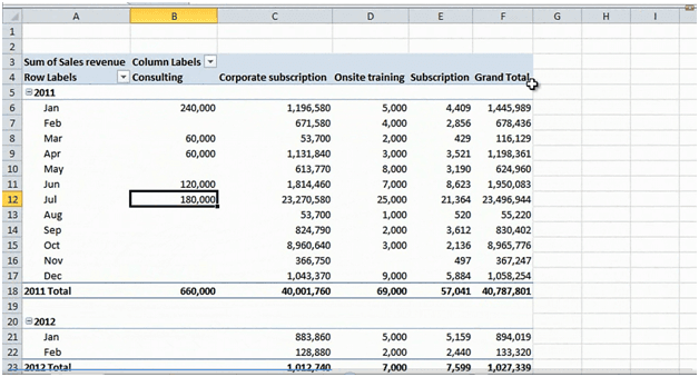
From this PivotTable I can clearly make out that our largest total sales revenue was in July and the smallest total revenue was in August. So now I’d like to dig a little bit deeper to understand which type of products we’ve sold. To do that I take the “Product Category” field and I’ll pull it down and put it into the Column area. Now I get the Product Category across the columns. So now I can see that the majority of our sales are coming from our Corporate subscriptions.
As you can see some of these fields are empty. That means that we haven’t sold anything in that product category for that month. If I’d rather show this as zero I can change how Excel shows empty values. To do that just right click and select “PivotTable Options” under “Format for empty cells” put a “0”and then just click OK. And now you can see that the empty cells are showing a “0”.
How to filter in a PivotTable (04:50)
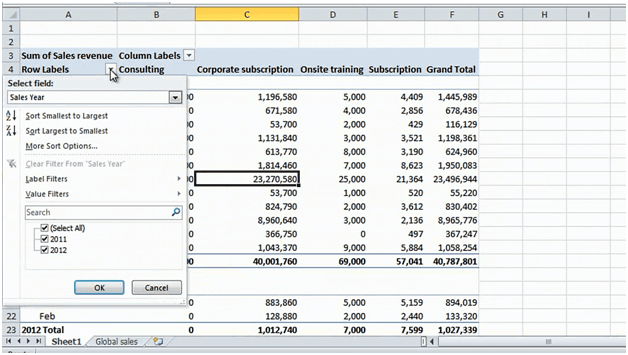
As you can see we had a great month in July for Corporate subscriptions. Now I want to analyze this further to understand who we’ve sold to. To do that I’m going to filter on July and Corporate subscriptions. To filter in a PivotTable you can either go to the drop down arrow or you can go to the field list.
Here I’ll select “Product Category”, deselect “Select All” and then select “Corporate subscriptions”. And then I’ll do the same thing for the Sales Month; deselect [Select All] and select “July”. OK.
Now I’m just looking at July 2011 and I’m only looking at Corporate subscriptions. To open up the field list again just click anywhere in the PivotTable. Now I want to know which country we sold these Corporate subscriptions to. So I’m going to take the “Country” field and I’m going to pull it down to the Row labels underneath Sales Month. Now you can see that the majority of the Corporate subscriptions were sold to Saudi Arabia.
Change how data is calculated (05:53)
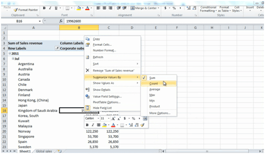
Now the question is; was this one big deal or did we sell to multiple customers this month? In order to find out I can change the way we’re looking at the sales revenue. So instead of totaling all the sales I can count the number of deals.
So to do that I can right click and then [Click] “Summarize Values By Count”.
This tells me that we had twelve sales transactions in Saudi Arabia for the month of July.
Drilling down to details (06:18)
If I want to see more details on the exact customers we’ve sold to I can just double click on this number and the details will open up in a new sheet.
So I’ll double click and here you can see all the details. I can see when they were sold, which customer they were sold to and the amount for each deal. To go back to my PivotTable I just click Sheet 1 where I have the PivotTable.
I’m going to go back to show the values by sum and I want to turn off the Grand total column since it makes no sense to me to have these numbers twice. To do that I’ll click the “Design” tab and then go to the “Grand Totals” and here I’ll select “Grand Totals On for Columns only”. So now I’ll just have the Grand total at the bottom.
Adding more values to the PivotTable (07:03)
I can add more values to my PivotTable. So here for instance I want to see the number of subscribers. So I’ll take the “Subscribers” field and pull it to the Values area. You can see here that it’s added as “Count of sales transactions for subscribers”, but we want to look at the total number of subscribers. So again, we’ll right click and say “Summarize values By Sum”. And now we can see the total number of subscribers for each country in July 2011.
Removing filters and fields from your PivotTable (07:31)
The final thing I want to look at is total sales revenue by account manager. So I’m going to remove the filters and move some fields around. To remove a filter just click next to the field name and select “Clear filter” or you can go to the “Options” tab and click Clear and select “Clear filters”.
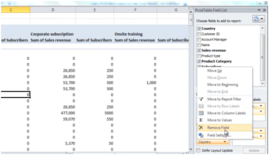
To remove fields from your PivotTable you can either click the drop down arrow and select “Remove field” or you can just grab a field by holding down your left mouse pointer and just removing it from the area.
I’ll remove “Subscribers” and then I’ll add the “Account Manager” field to the Row labels area. I’ll move the “Sales Year” to the Column label to get a better overview.
Sorting data in the PivotTable (08:14)
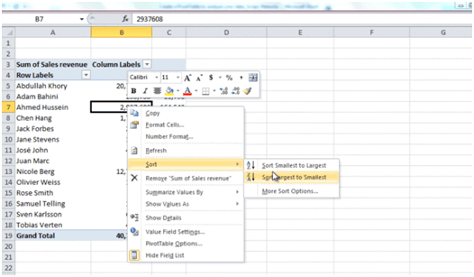
Now I’d like to know which Account manager sold the best in 2011. To do that I’m going to sort largest to smallest.
So I’ll right click and then I’ll select “Sort”, [Click] “Largest to Smallest”. Here I can see that Abdullah had the largest total sales revenue for 2011. If I do the same sorting for 2012; [click Sort], [click] Largest to smallest I can see that currently Nicole has sold the most for 2012.
Closing (08:38)
As you can see the PivotTable is a very powerful tool to quickly analyze data in Excel 2010. When you get the hang of it you can slice and dice your data to provide additional insights. You can also add a visual element to your analysis by creating a PivotChart, but more on that in another video. I’m Ulrika Hedlund for Business Productivity – Thanks for watching!


